
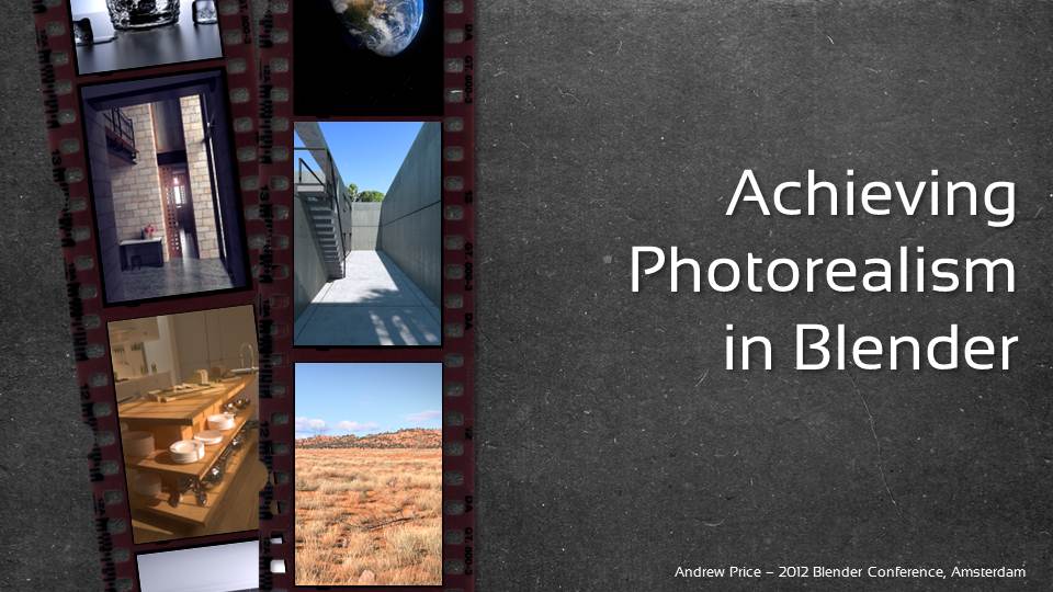
Achieving Photorealism in Blender

This is a summary of the presentation that I gave at the 2012 Blender Conference in Amsterdam.
For those that couldn't be there, I've written this summary...
(Unfortunately the video I recorded on the day was too dark and difficult to hear, so I figured there was no point in uploading it. Sorry about that!)
Have you ever tried to create a photorealistic scene in Blender? Have you ever failed? You're not alone.
In this presentation I'm going to break down the topic of photorealism into easy to understand concrete ideas that you can use in your next project.
Photorealism is when something comes so close to realism that it's indistinguishable from a photograph. Artists have been doing this for hundreds of years with paint and pencils, but with the advent of cg software, the process has become a whole lot easier and more fun.

I first became interested in the topic of photorealism when I came across this website called "Fake or Foto" 8 years ago. It was created by Autodesk, and in my opinion is one of their smartest marketing campaigns.
The viewer was presented with 10 images and had to guess which ones were real photographs and which were cg images. When I first saw this 8 years ago at the ripe age of 16, my mind was blown. The idea of creating something that looked identical to a real photograph conjured up limitless ideas in my mind.
Ever since then I've been trying to achieve photorealism in my works...


Why Photorealism is Important
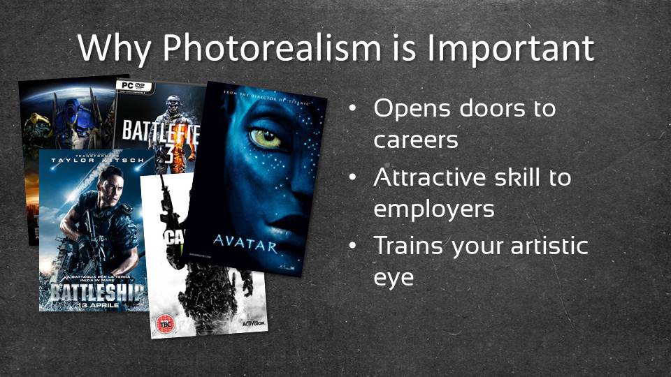
If you pay any attention to the entertainment industry you'll notice that an increasing number of movies and video games are centered around photorealism.
Whenever a movie needs to blend live action with VFX, it needs to look photorealistic. Video games have been feeling the pressure too, with fans now judging their games based on how realistic it is in comparison with others. If you've ever read a discussion on CoD4 vs BF3, you'll know exactly what I mean.
Most would agree that the line between reality and fiction is becoming increasingly blurred. So as an artist, being able to master photorealism puts you in a good position, and makes you more desirable to an employer.
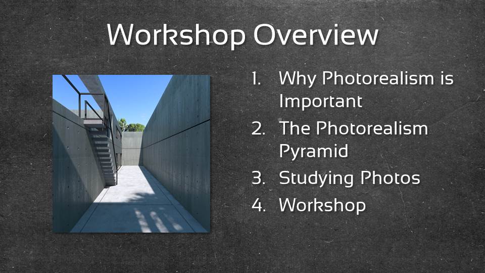
The Photorealism Pyramid

To help better understand what makes up a photorealistic image, I've created the "Photorealism Pyramid": Modelling, Lighting, Materials and Rendering.
All of these elements are required for cg images, but photorealism only occurs when all 4 are perfect.
Here's an example using a breakdown from The Nature Academy trailer. First the geometry is laid out, then lighting is added, then materials and finally post processing is added for rendering.
Studying Photos

One of the best ways to get good at photorealism is to start by analysing real photographs and training your eye to notice the small amounts of detail.
Take a look at the following photographs and try to think about how you would approach each one in blender:
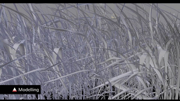
Modelling

How would you model this flower in blender? By zooming in on the flower, you can see there is a dense amount of detail around the bud, so you'll need to decide early on about how much to model and how much you can fake.
Next is topology. Looking at the petals you can see that the ridges pinch at the base and flow outwards, so you'll need to use proper mesh topology to ensure the models look as clean as possible.
Finally scale. It's one of the most overlooked parts of modelling and pertains to how big objects are in comparison to the rest of your scene. If you made the flower as big as a tree, it's going to immediately look fake to the viewer. If you get the proportions wrong in modelling, then you've shot yourself in the foot before you even start.
Lighting

Now let's analyse this photograph of a carpark in Japan. How would you light this scene in Blender? The main light source is clearly the sunlight. Look closely to the temperature of the light and the size of it's shadows. This will tell the viewer what time of day the scene is (sharp shadows + white light = noon).
Next you have the environment lighting (lighting from the sky). This is easily added in the world settings (in Cycles). Pay attention to the color of this light and it's strength if you want to get a perfect match to a photograph. The human eye is very good at picking up subtle inaccuracies.
Finally you have bounce lighting. Thankfully this is mostly now solved thanks to the Cycles render engine. It's unlikely that you'll need to add any extra bounce lighting as Cycles does this fairly accurately automatically.
Materials
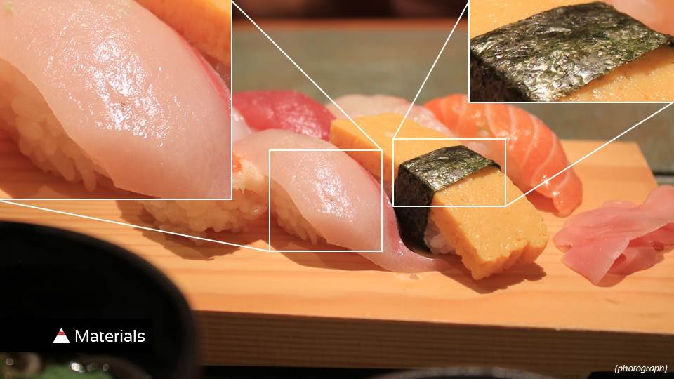
According to Pixar, when making Ratatouille, the food was one of the biggest challenges. This is because the properties of food materials are complex and hard to make it look life like.
So what better example than sushi? :)
Looking at the pink piece of fish on the left you can see that the entire surface is very wet (making a glossy map unnecessary). However it has a very fine level of bump, so a high resolution custom bump map will be perfect. Also notice that the towards the bottom of the fish, it gets darker. This is due to the light dispersing as it passes through the flesh of the fish. To recreate this in blender you'll need to use SSS (SubSurface Scattering). Unfortunately this feature isn't in Cycles yet, but it's planned for 2.65-2.67.
Next let's look at the piece of seaweed on the right. You'll notice that there is a subtle amount of bump, but more importantly, some portions of the seaweed are shinier that others. This means that a glossy map is necessary to get a good level of realism.
Rendering

The final step for matching a cg image with a photo is adding the appropriate amount of post processing.
Looking at this image you can see several camera flaws. The first is the very obvious sunflare, that occurs naturally in cameras when light bounces around the internal components of the camera. It's one of the more fun aspects of post-processing and quite a few artists go overboard with it. Look at real photographs to determine how much flare to use.
Next, notice the Chromatic Aberration. This is a rather ugly camera flaw that creates a red/blue outline around objects in the photograph. It's most prevalent when high contrast areas clash with low constrast areas, and is also more obvious in cheaper cameras. You can add this in blender by using a Lens Distortion node in the compositor and increasing the Dispersion amount. Note: Professional photographers go to great lengths to eliminate Chromatic Aberration, so if you want your scene to look professionally shot, skip this.
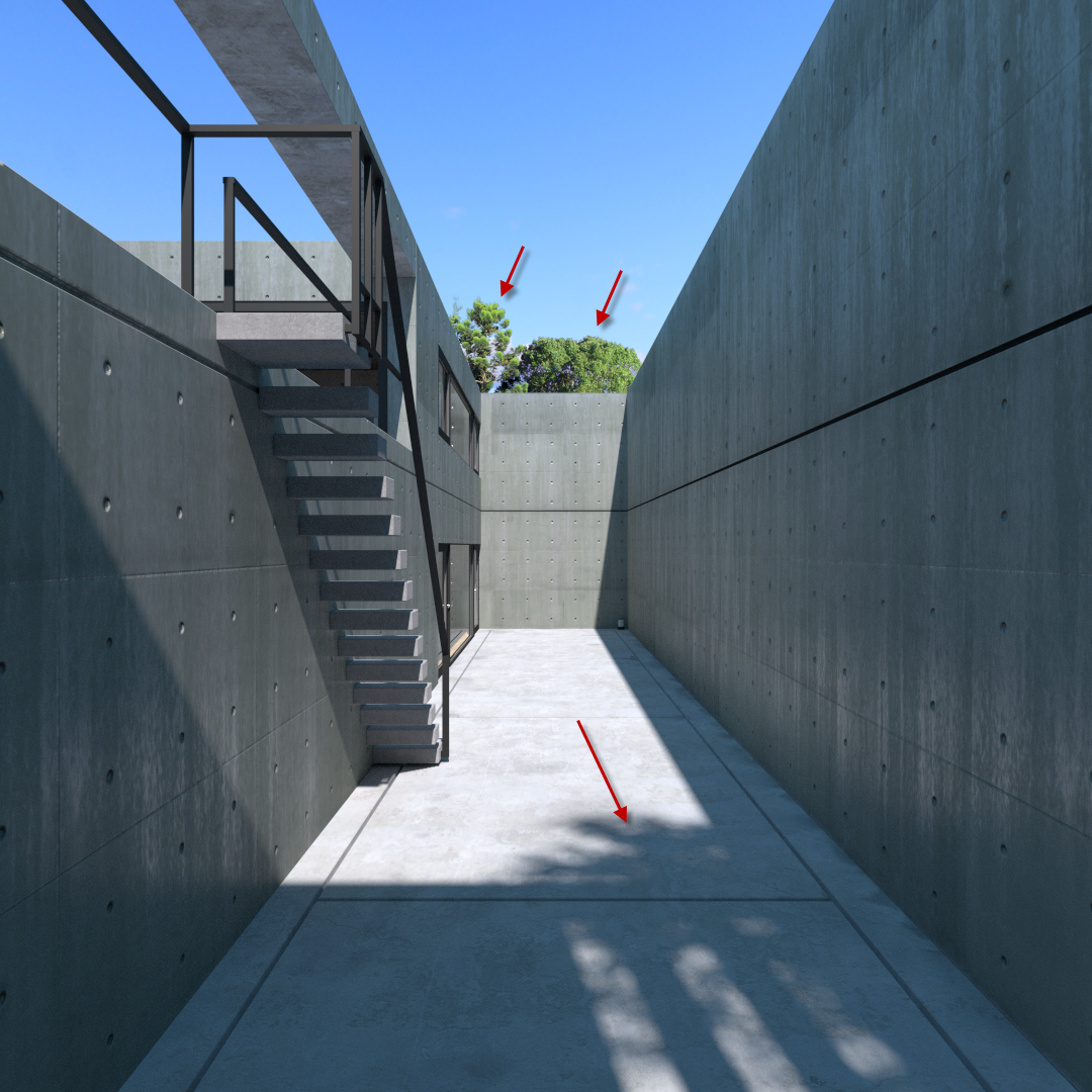
Another key camera flaw is Barrel Distortion. This is a very subtle camera flaw that slightly bends the images outwards, creating unstraight lines. It's most noticeable when looking at the wall of this building. Upon first sight you may miss it, but if you drew a line from top to bottom (as I have done here) you can see that the wall is indeed bending outwards. You can create this in blender using the Lens Distortion node in the compositor, and increasing the amount of Distortion. But again, pro photographers eliminate this in post production, so use it only when necessary.
Finally you have Focal Blur (aka Depth of Field of DoF). This is probably the most obvious effect. It's when objects in the foreground or background become blurry. It is both a camera flaw and a creative tool. It adds realism whilst also allowing you to point your viewer to a certain element by focusing on it. However be careful not to overdo this or your scene may appear miniature in size to the viewer.
Workshop

To demonstrate these tactics, I'm going to give you a brief summary of how I created some of the above image. I'll be showing you in the same order as the photorealism pyramid.
A detailed explanation of how photorealistic architecture renders can be found by joining The Architecture Academy, but here's a brief making-of:
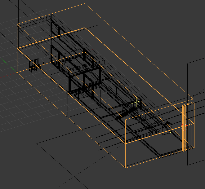
Modelling

The house was built to scale by taking measurements from a book, and modelling them to scale in blender.

Once you've enabled measurements you can find out the size of any object by pressing N.

Once you start modelling with measurements you'll never go back ;)
Lighting


Next you'll want some environment lighting:

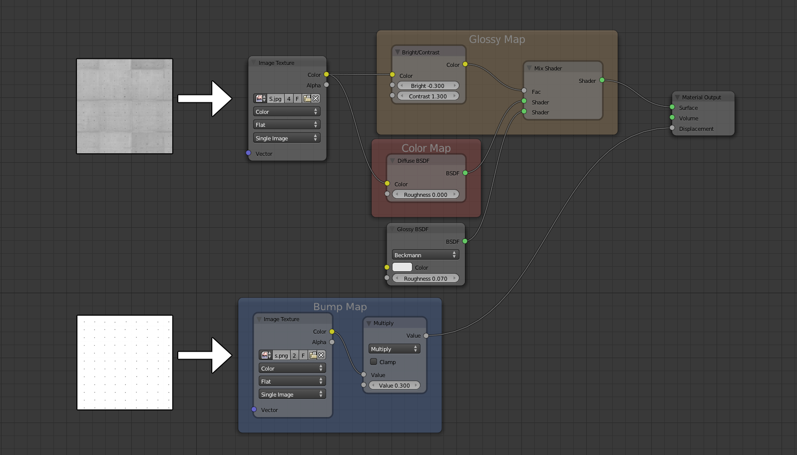
Materials
Next, let's look at the material of the Concrete wall:
Rendering
I want the image to look as though it was a taken by a professional photographer, so a lensflare, chromatic aberration and lens distortion will not be inappropriate.
However, focal blur would add a nice subtle touch:

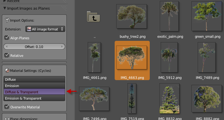
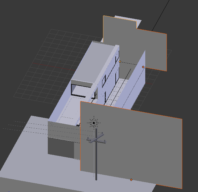
Now let's add some trees:


There's obviously a bit more to it than that, but trying to fit all this into a 30 minute workshop live on stage was pretty tough.
Want to learn more? Join The Architecture Academy, and discover the secrets to achieving photorealistic architectural renders.