
Understanding Colors

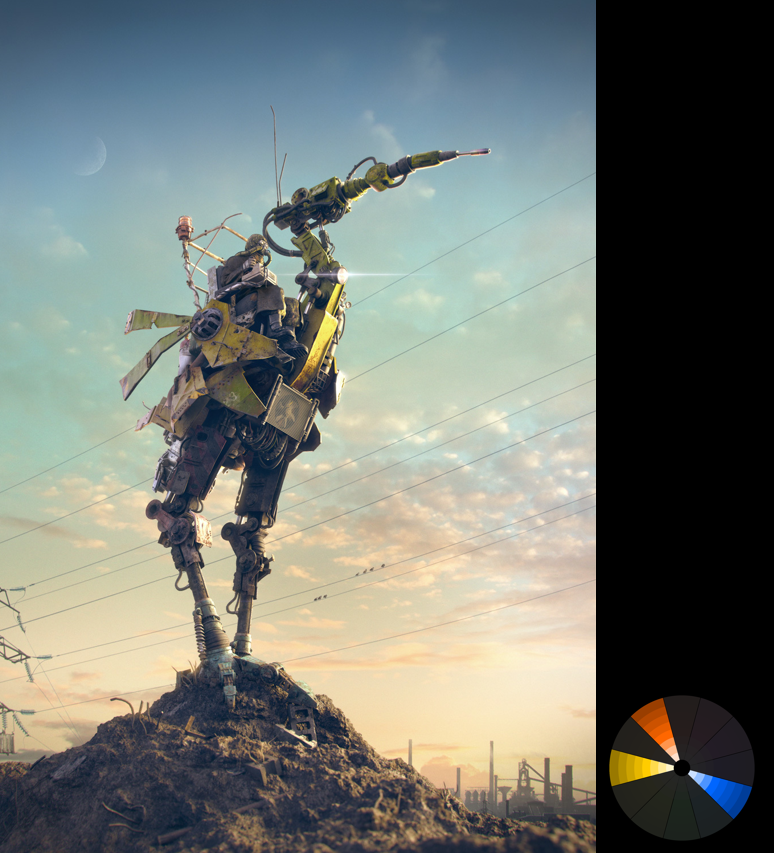
When used correctly, color can change the mood of the image, or impact the story. It can also draw the viewers eyes to a focal element. In the image below, digital colors are used effectively to focus your attention on the tube. And the controlled color palette also helps keep the image calm.
Color is used effectively in this image to keep the mood playful and light:
Saturation and Value
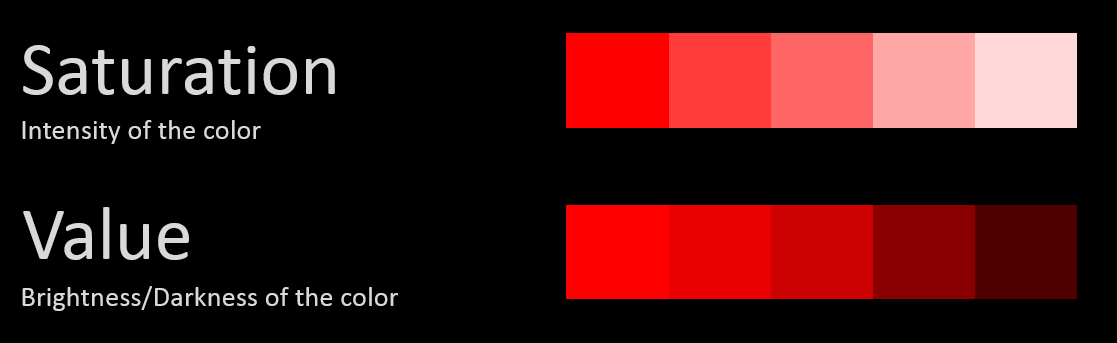
A lot of people think Colors are all about harmonious relationships. But Saturation and Value are equally as important, if not more so. Without a clear understand of what saturation and value is, and why it's important, no color scheme will ever help you. Saturation is about intensity, and Value about Brightness/Darkness.
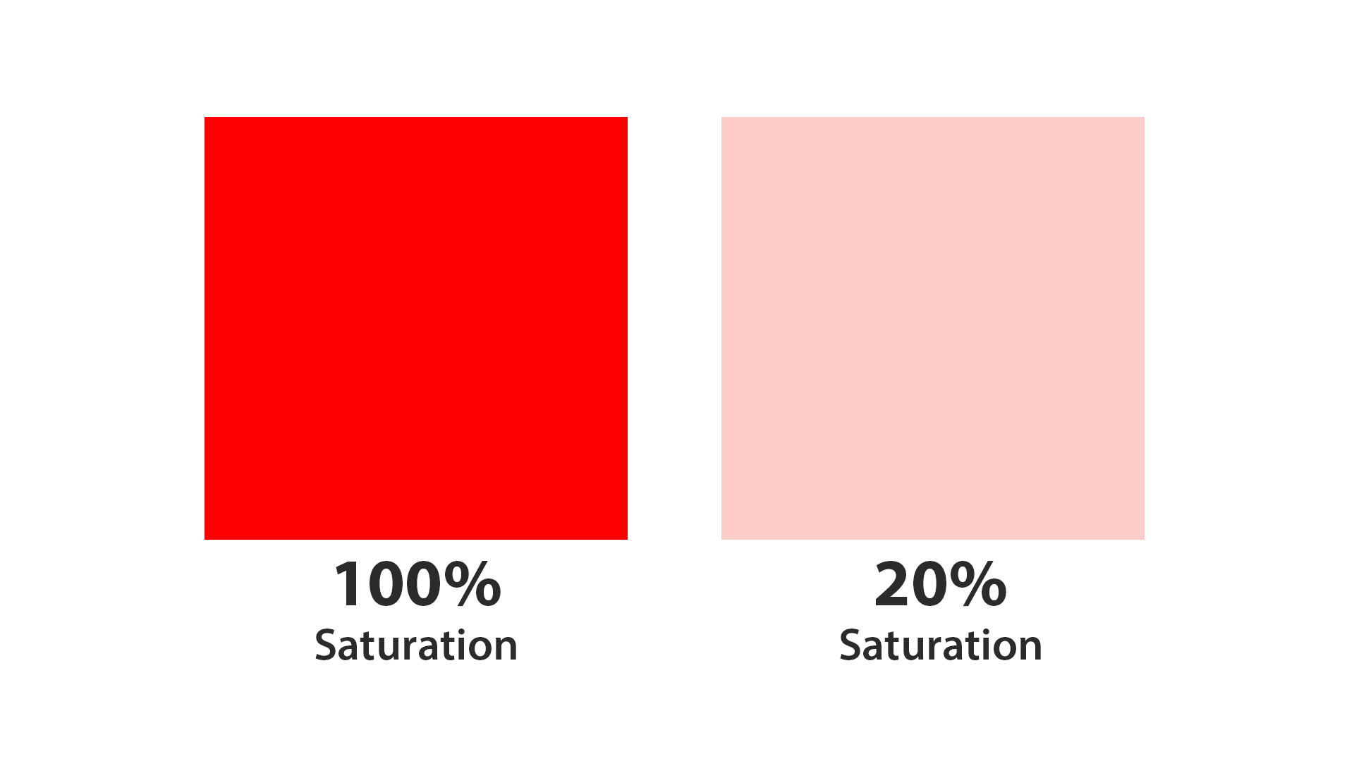

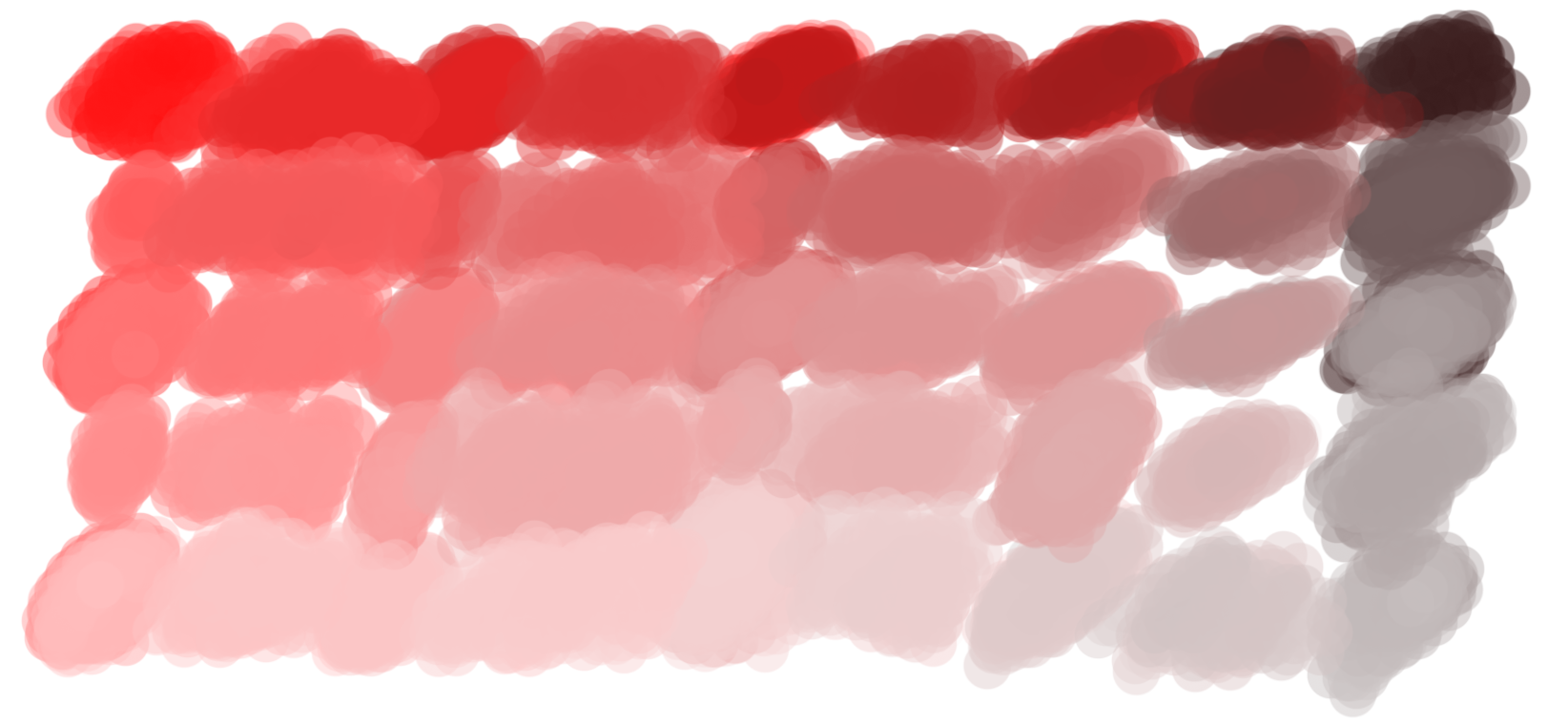
At 20% saturation, red turns into a fleshy pink. And at 20% value, red becomes a dark muddy brown. In fact just using the color red as a starting point, you can create these shades simply by changing the saturation and value: "Yeah, but why is this important?" Because Saturation and Value can make or break your image. The biggest problem I see with CG renders is oversaturation:

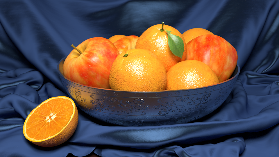
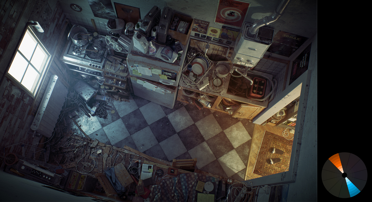
Example of an overly saturated scene
By forcing strong saturated colors on the viewer, you give them no where for their eyes to rest. Just like you never go full retard, you should never go full saturation. Here's a much better level:
Corrected scene
Not to say that saturation is bad though. In fact it can be excellent when used in moderation:
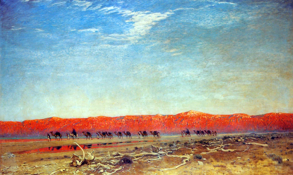
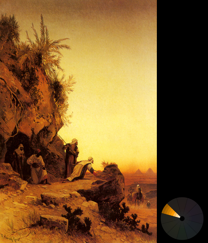
Maxfield Parrish – Salzkarawane am toten meer (from ArtRenewal.org)
The striking red mountains catch your eye immediately. Doing so makes it the focal element of the entire image. In this image, a single note of saturation helps to guide your eyes through the scene:
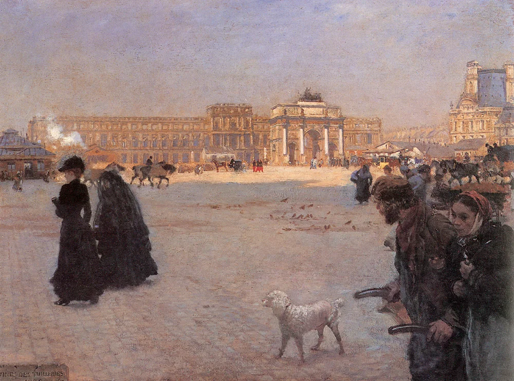
Giuseppe de Nittis – The place de carrousel and the ruins of the tuileries palace in 1882 (from ArtRenewal.org)
And in this image, saturation is used to make Jesus look powerful amongst a group desaturated onlookers.
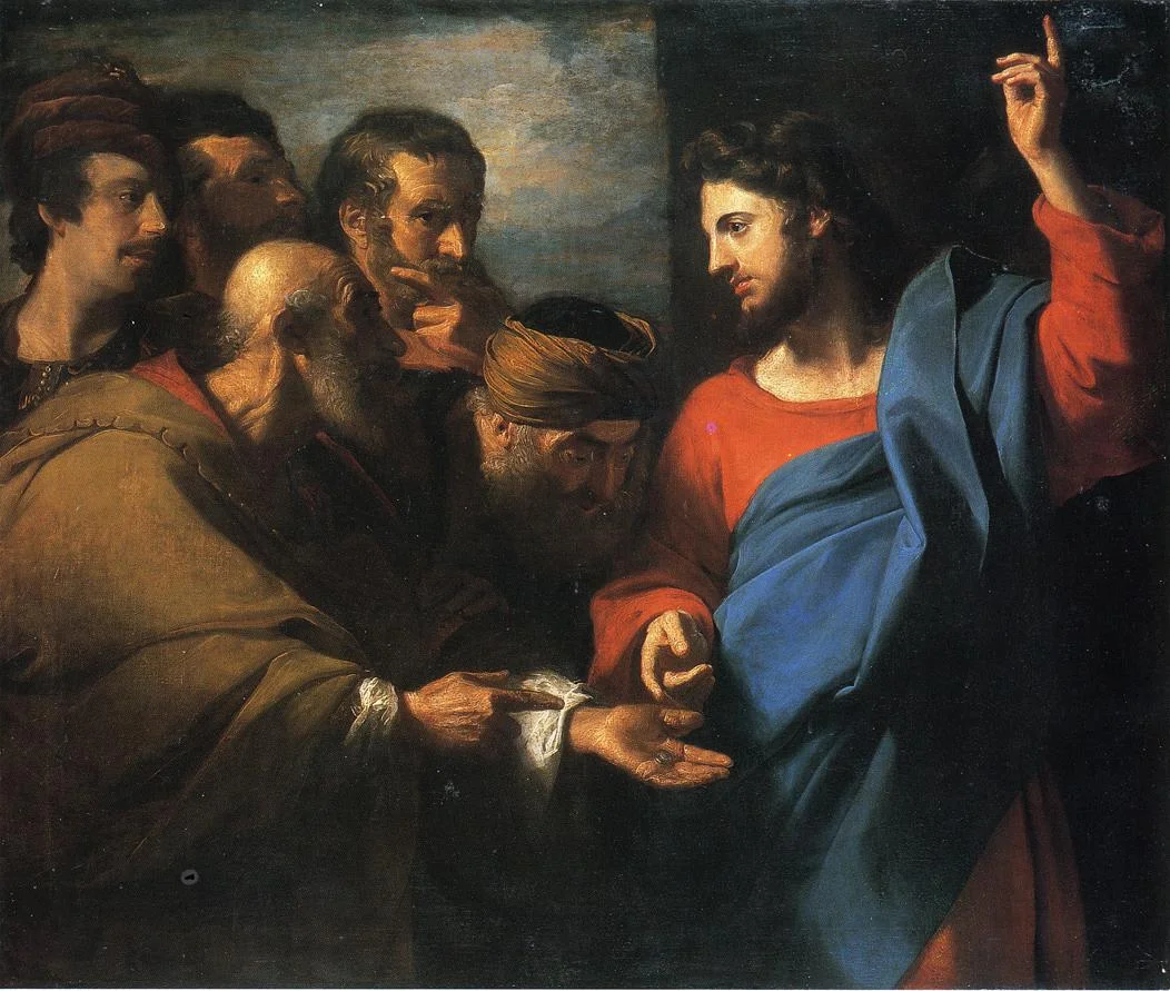
John Singleton Copley – The tribute money (from ArtRenewal.org)
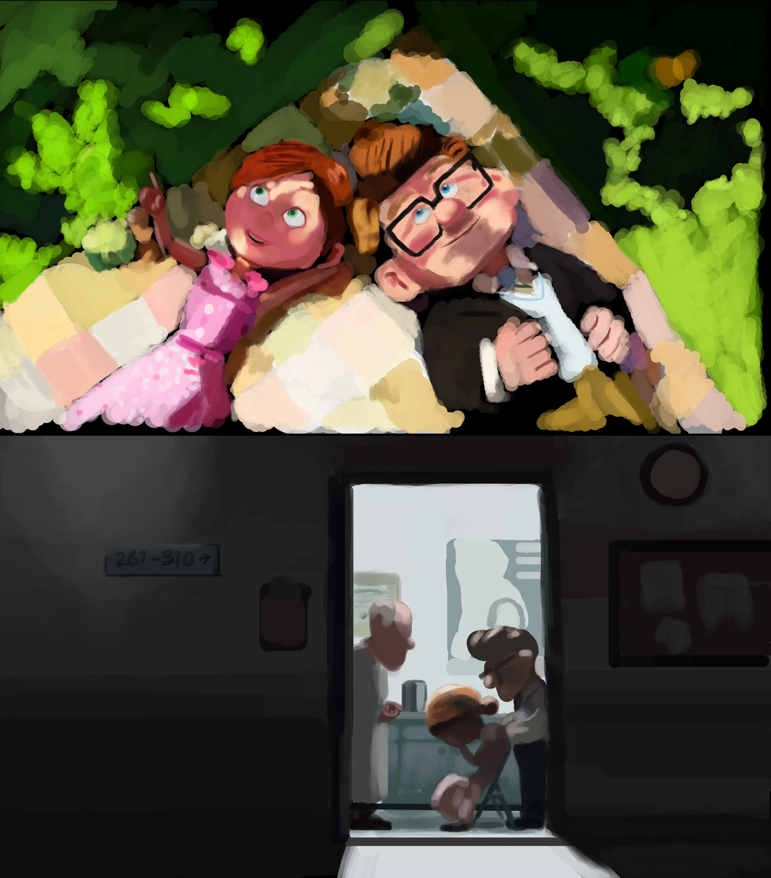
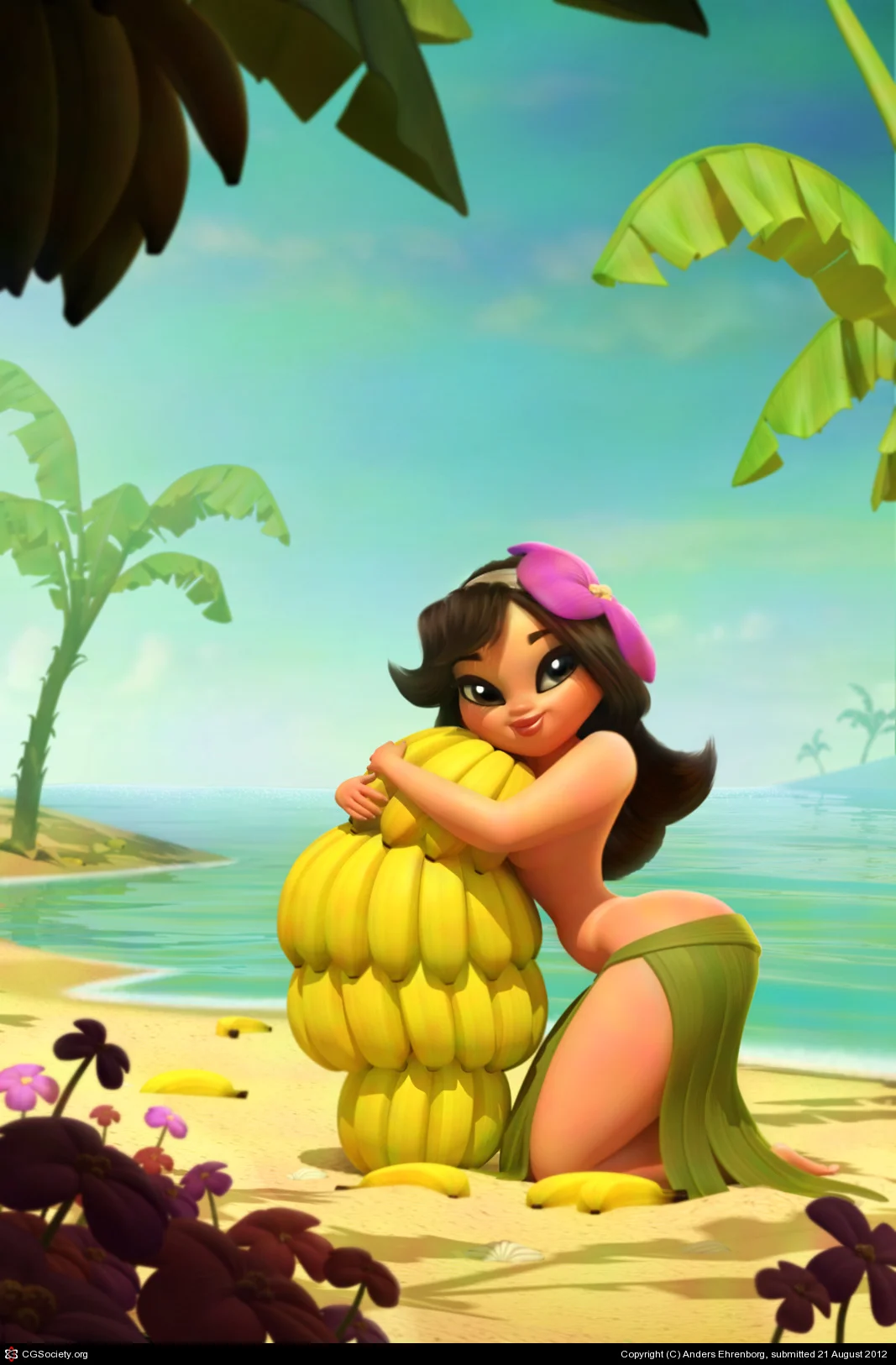
Saturation can even alter your mood. At the start of Pixar's UP, the colors are vibrant and alive to signify their joyous life. But when tragedy strikes, the colors are immediately desaturated. This simple touch of desaturation makes the viewer feel the pain and loneliness of the characters. It's used extensively in hollywood and first-person shooters. For cartoons, saturated bright colors can play to the artists advantage, as it immediately tells the viewer that this is fake:

Courtesy of Anders Ehrenborg and Chris Sanders
So as you can see, learning how to use Saturation and Value effectively can vastly help tell your story. With that out of the way, we can finally get into...
Color Harmonies (aka Color Schemes)
Everyone knows that some colors look better together than others, but it can get confusing if you try to remember which ones. Here are 6 of the most effective Color Harmonies...
1. Monochromatic

This one is the easiest to remember, because it's just one color. Due to the absence of other colors, the viewer is left to focus on the differing values and saturation. Making it great for single subject shots or dramatic atmospheric scenes. Examples:
Hermann David S. Corrodi – The ambush (from ArtRenewal.org)

Courtesy of David Munoz Velazquez and Fran Camos
Check out more monochromatic examples here.
2. Analogous

Analogous harmonies use colors that are adjacent to each other on the color wheel. It's frequently seen in nature, making it great for creating a calm, comfortable and peaceful mood. Examples:
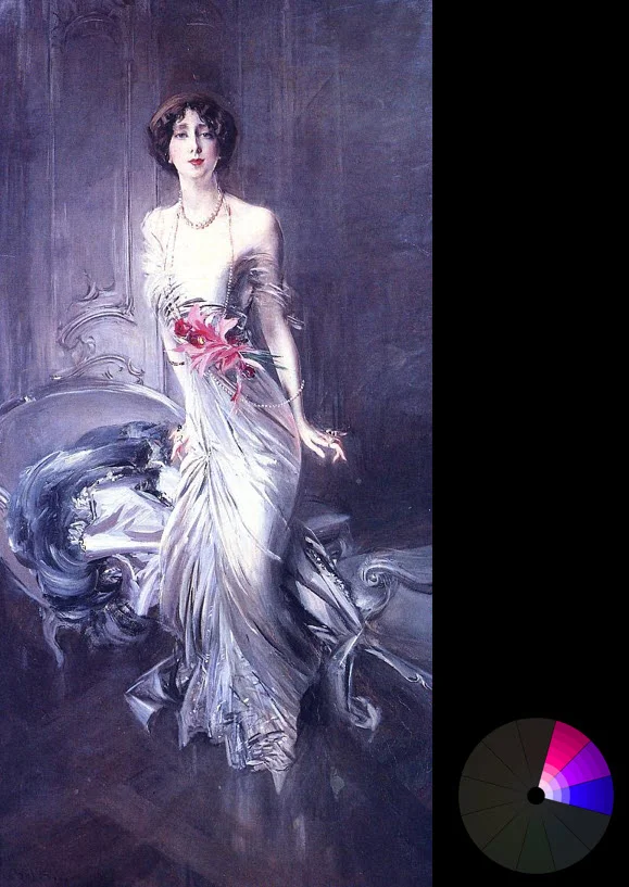
Created by Giovanni Boldini – Portrait of madame E L Doyen (from ArtRenewal.org)

Courtesy of Carlos Ortega Elizalde
3. Triadic
This one is probably one of the hardest to pull off well. It's three colors that are equally distant to each other. It's hard to do, because if used in equal amounts it can create ugly chaos. It's best used for cartoon style scenes since the colors can look almost childish.

Carl Heinrich Bloch – Casting out the money changers (from ArtRenewal.org)

Courtesy of Ehsan Hassani Moghaddam
4. Complimentary

This one is definitely the most popular: colors on opposing sides of the wheel. They just naturally go well together. A common misconception is to use equal amounts of each, but this will more than likely create ugliness. You want to choose one color as the predominant one (usually the cooler color) and use the other to create splashes of interest. Use lots of browns and greys for a better effect. Examples:

Frank Dicksee- Chivalry (from ArtRenewal.org)
Courtesy of Cornelius Dämmrich

Courtesy of Toni Bratincevic

Courtesy of Jean-Michel Bihorel

Courtesy of Baolong Zhang
Complementary colors accentuate each other. Meaning that a dull green against a red background, will suddenly look more saturated. So be careful of the saturation.
5. Split Complimentary

Similar to the complimentary harmony, this involves taking one opposite color and splitting it. This is useful for extending your palette (when two colors aren't enough), or to create a more joyous mood. Examples:

Eugene Bidau – A Peacock and doves in a Garden (from ArtRenewal.org)

Courtesy of Jaroslaw Waskowiak
Courtesy of Daniil Alikov

Courtesy of Carlos Ortega Elizalde

Courtesy of Anthony Guebels

Courtesy of Anders Ehrenborg and Bill Presing
6. Double complimentary
Just like the complimentary harmony, only double. Two pairs of complimentary colors (doesn't matter where on the wheel). You have to be careful with this one as using equal amounts of all four will create chaos. It looks best when the foreground is one pair, and the background is another. Mixing the pairs can get tricky. Examples:

Thomas Moran – The autumnal woods (under the trees) from ArtRenewal.org
^Notice the complimentary pair of colors in the foreground, and another in the back?

Courtesy of Rafael Reis

Courtesy of Sergii Andreichenko

Courtesy of Anders Ehrenborg and Chris Sanders
Resources
SmashingMagazine - 3 Part Series on Color Theory. Goes more in-depth into the theory of color.
Kuler - Awesome online app for helping you create harmonious color schemes.
Colrd - Great for seeing the color schemes used in photos and illustrations.
Designspiration.net - Awesome for finding images with a specific color scheme
ShutterStock Spectrum - Fun site that allows you see stunning photos using specific colors.
colourlovers.com - Community of Color Lovers. Find popular palettes or make your own.
design-seeds.com - Beautiful photos and their main colors.
Hope you found this useful! Now get out there and make some colorful art :)