Create a Shiny New Wallpaper
Hello there! Just in case you missed the important news, this month Blender Guru is focusing entirely on 3d typography! That means that for every week in the month of August a new tutorial will be posted to help you learn more about 3d typography in Blender. On that note, I'd like to welcome you all to Week 1!
This tutorial will take you through a beginners course of creating 3d typography in Blender and making it look fantabulous!
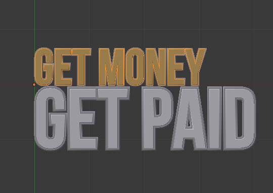
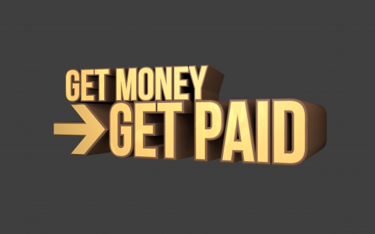
Here's what we are creating:

In this tutorial you will learn how to:
- Create text with custom fonts
- Add bevels and other effects to make the text 'pop'
- Make the text more attention grabbing with text outlines
- Create a golden material
- Fake reflections for fast render times
- Add a striking background with gradients and stripes
From start to finish 100% in Blender 2.53.
Ready? Let's begin!
NOTE: I have catered this tutorial to the 27% of my readers that prefer to read text instead video. The next 3 tutorials will be video I promise ;)
Adding the text
Start with a new scene and delete everything. Then Press Numpad 7 to go into top view.

Add text by pressing Shift+A and selecting Text.
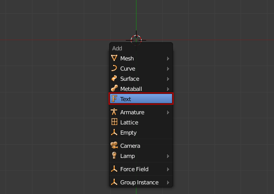

Press TAB to go into edit mode and type whatever text you want.
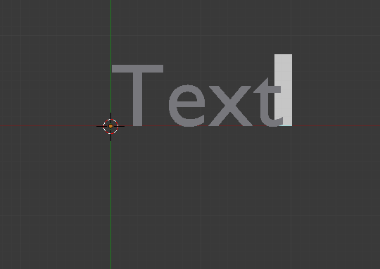

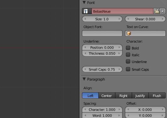
Currently the font is using the default font which is both boring and ugly. Let's change that! Hit the Font tab.

Scroll down till you see the font section. Unlike some programs, blender will not automatically provide a drop down list of installed fonts. You will need to locate the font on your hard drive. To do this, press the folder button:

This will bring up a file directory. If you are using Windows, you will find all installed fonts under C:\Windows\Fonts\
I will be using a font called BebasNeue. Not your style? Check out 20 Big and Bold Free Fonts for some other great choices.
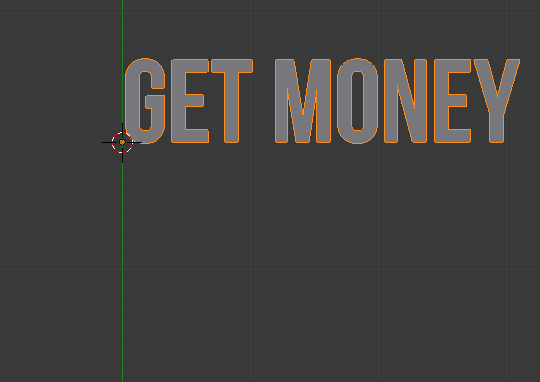
Lookin' good!
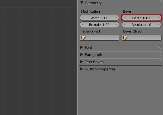
Now let's change how the font will look. Most of the controls are in the Geometry box.
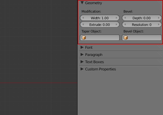
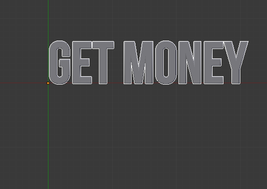
The Extrude value defines how much to extrude the text into 3d space. The default value is 0, which is completely 2d. Let's change that to 1.
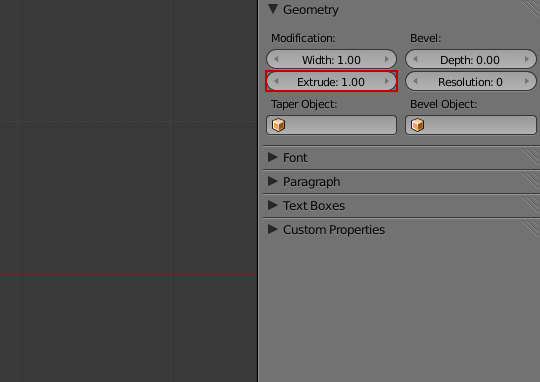
Shazzam! The text is 3d! *high fives cat*

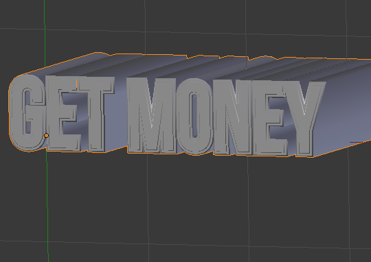
Now how about giving it an edge? The Bevel Depth value will give the text a rounded edge making it look smoother and less computer generated. Set this value to 0.005 (the screenshot shows 0.01 as it is inconveniently rounded up)
Much better!

See that smooth edge? Nobody's getting paper cuts today :)

Creating an outline
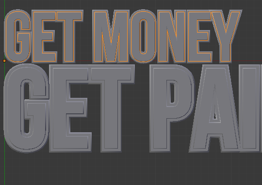
To break up the uniformity and make the text stand out from the background we will be creating a second text object that is slightly larger and a different colour.
Duplicate the current text object (Shift+D), and hit Esc to leave the duplicate text in the exact same position as the original.
Now make the duplicate text slightly larger than the original:
Set the Width to 1.02 to make it fatter.
Set the Extrude to 0.99 to make it shallower.
Set the Depth to 0.01 to give it a more defined edge.

Perfect! We now have a striking outline around the original text.
If you want to recreate my example exactly, then duplicate the text, and place it underneath the other. Scale it up to give it a larger more emphasized look.

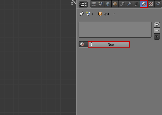
Adding the materials
We will start by creating the material for the inner text, so select it as shown:
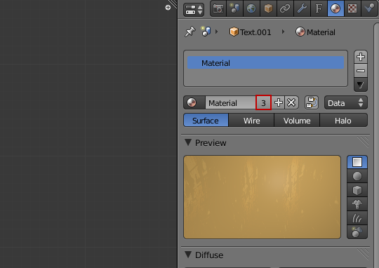
Now open the materials panel and select New to add a new material.
In the diffuse panel, click the coloured box and colour wheel will popup. Change the value to creamy coffee colour. I have used R: 0.800 G: 0.500 B: 0.150
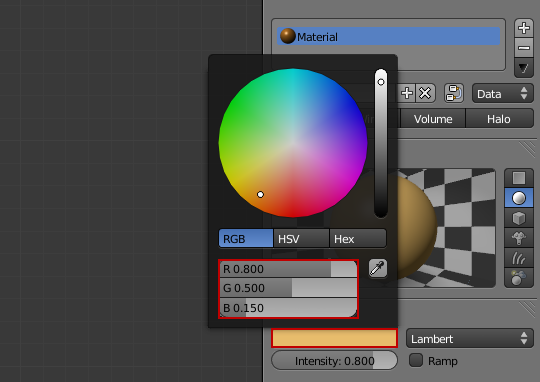
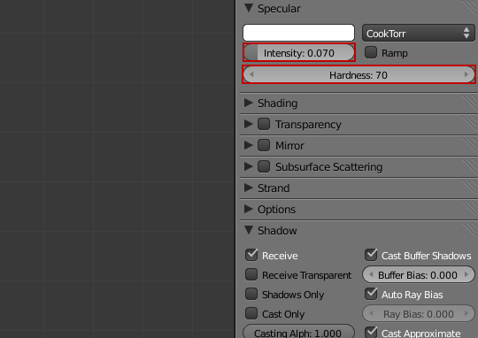
Next change the Specularity intensity to 0.70 and the hardness to 70. This will give the text a slight sheen to mimic reflecting light.
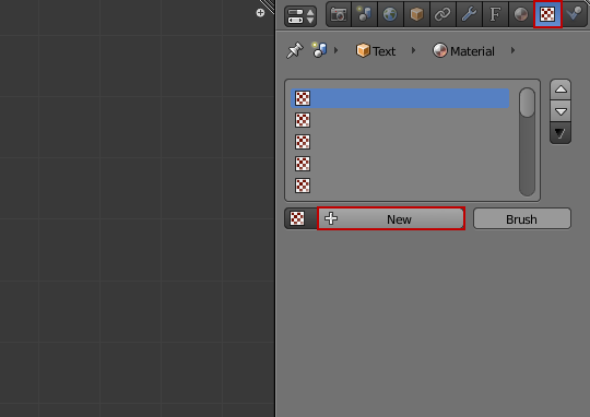
We will now create a fake reflection map to mimic the look of real shiny gold. If we use an image to fake reflections instead of calculating real reflections based on ray tracing we can cut down on render times considerably.
Open up the texture panel, and click New to add a new texture.
Set the texture type to Image or Movie from the drop down list.
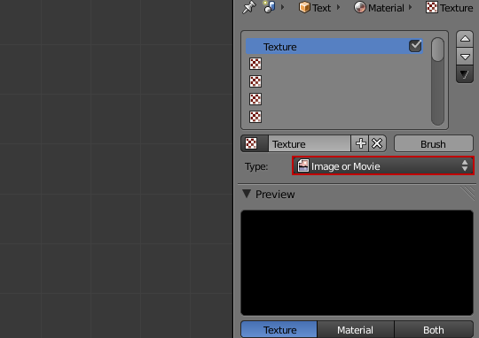
Click Open and locate an image on your hard drive that you would like to use as a reflection map.

I will be using this photo of a studio lighting setup that I found on Flickr:
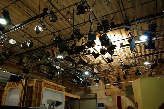
Photo by Brandi Sims
Important: Set the Mapping coordinates to Reflection. This will tell Blender to use the image as a reflection instead of standard texture that sticks to the object. If you skip this step your render will look horrible!

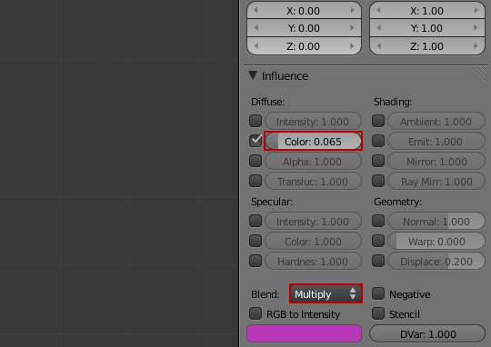
Currently the reflection is showing 100%, so you won't even be able to see any of the material colour! To fix this set the colour to 0.065. Set the Blend type to Multiply so that only the lighter parts of the reflection show on the object.
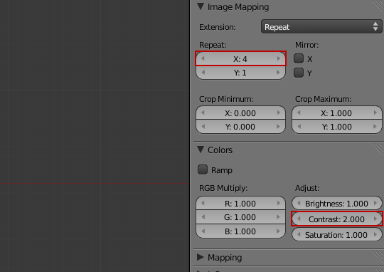
To fake the look of anisotropic blurring (similar to brushed metal), I have increased the repeat X value to 4. This will effectively squish the texture horizontally, making the reflection look vertically blurred.
The gold text material is now finished!
Apply this same material to the inside text of the other line of text.

Rock 'n' Roll!

Now select the outer border text. This material will be similar only darker.

From the drop down menu select the preview gold material but click the number next to the material name. This will create a copy of the material that we can edit without it effecting the gold material.
Label this material OuterText.

Click the colour box and select a rich chocolatey brown from the colour wheel. I used R: 0.180 G: 0.090 B: 0.050:

Now select the other outer text and assign the same material.

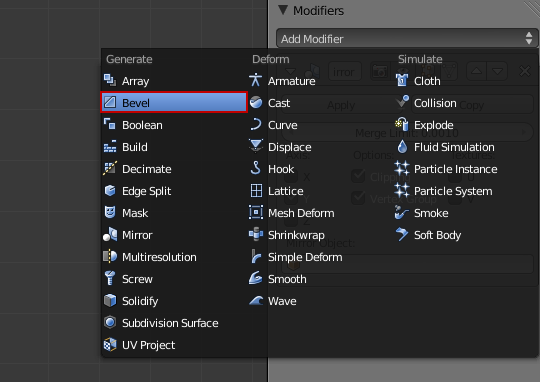
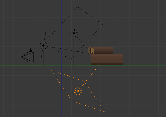
Creating the arrow
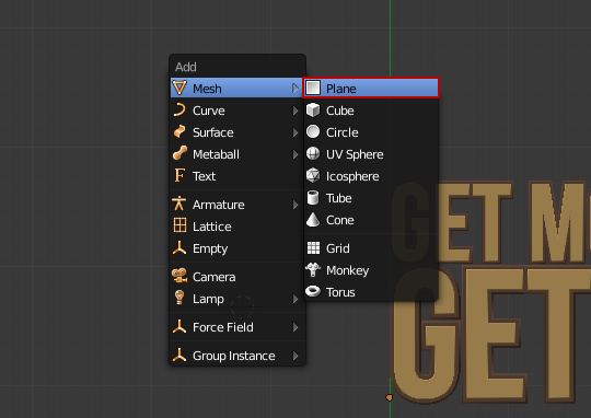
We will model the arrow by hand. First we need to add a plane. To do this press Shift+A and select Mesh>Plane.
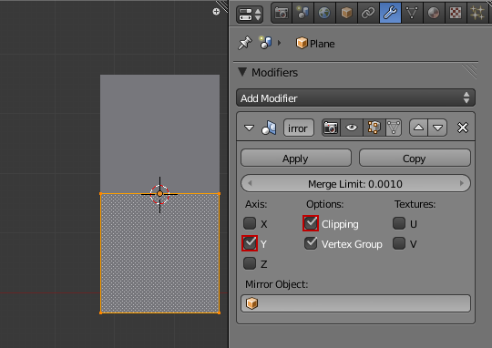
To save time we will use an array modifier. Switch to the Modifier tab and from the drop down list select Mirror.


The mirror will duplicate any action on one side of the origin, so go into edit mode and move the plane underneath the origin point:

In the mirror options enable the Y axis and clipping. The mirror array is now good to go!
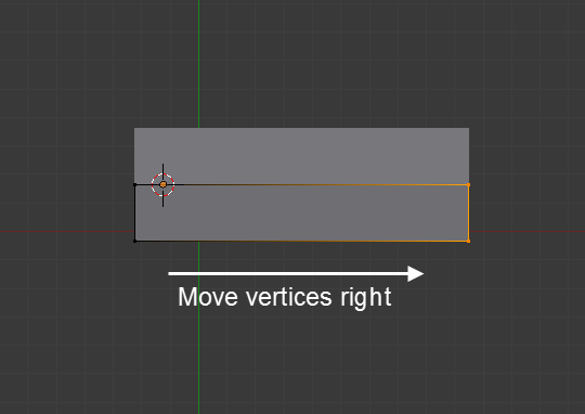
Start by moving the right hand vertices to the right.
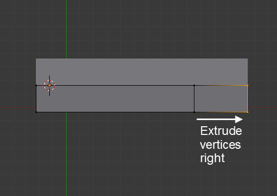
Extrude it as shown:
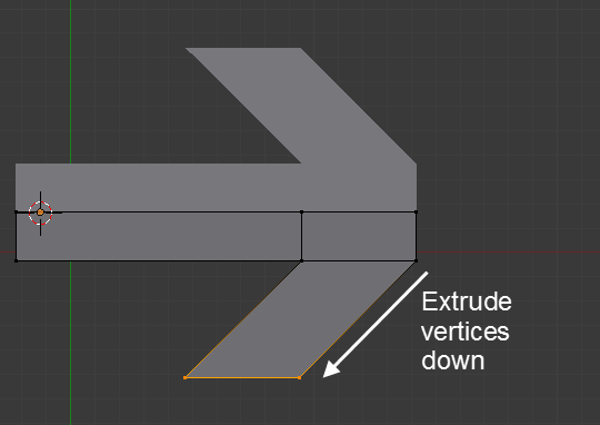
Grab the bottom two vertices and extrude them downwards and to the left.
Now take the end vertex and move it till it lines up with the angle of the arrow hand.

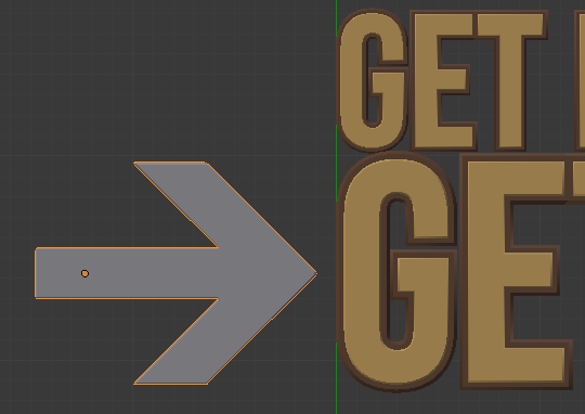
The arrow shape is complete!

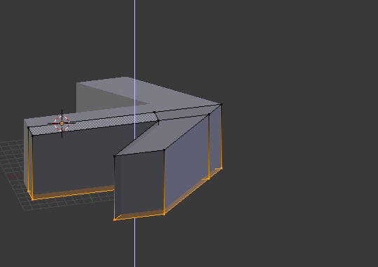
Unfortunately the arrow is 2d! Fix that by selecting all the vertices and extrude them downwards:
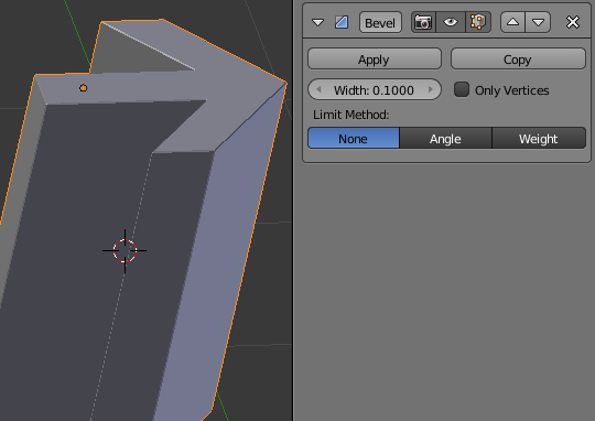
Now let's add some bevel so it matches the letters. Go back to modifier and from the drop down list select Bevel.

The default settings are perfect!
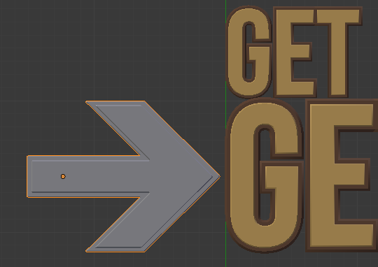
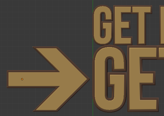
Line this sucker up with the letters:
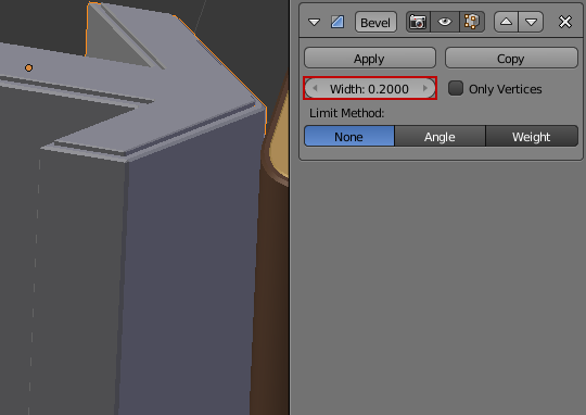
Now you will need to give it a border. Doing this is easy: Duplicate the arrow and scale it upwards till it creates an outer edge. You may need to enter edit mode and move some vertices so the proportions lines up.
For the outer arrow increase the bevel amount to 0.2. This will give it a slightly wider edge.
Now assign the gold and brown materials we created previously:
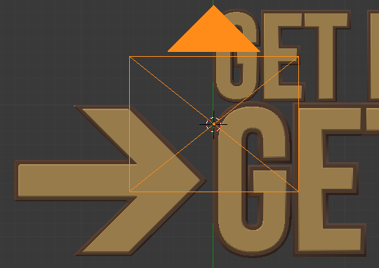
Position a camera directly in front of the letters.
If you were operating in top down view, now might be a good time to rotate it so it's flat along the ground plane.


Position the camera slightly to the right of the letters as shown:

Adding the lighting
Our lighting system will consist of 3 carefully placed area lights to simulate studio lighting.
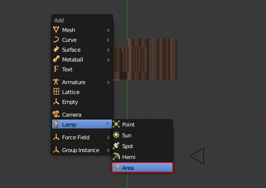
Start by adding an area lamp (Shift+A, Lamp>Area)
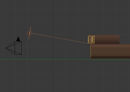
In top down view, position the lamp as shown:

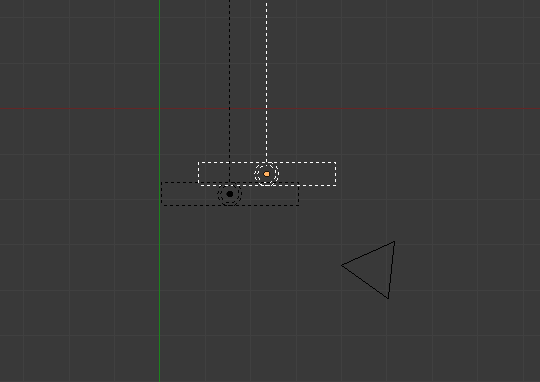
Switch to side view (NumPad 3) and tilt it as shown:
With the lamp still selected, go to the Lamp panel and change the Distance to 5, Size to 3 and Samples to 8 (to create smooth shadows).


Now make a second lamp by duplicating the first.
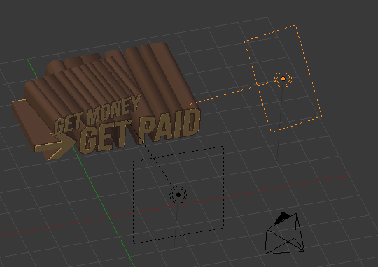
Place the lamp slightly to the right of the letters and pointing to the side.
This lamp is only providing secondary lighting so decrease the Energy to 0.5 and the Size to 5.


Finally we will create some bounce lighting. Duplicate the secondary lamp and place it underneath the letters pointing upwards.

This particular lamp is supposed to be very subtle so set the Energy to 0.2:

Nice!
But there's one more thing...
Currently the inside of the letters is looking a little bright. To fix this, let's add ambient occlusion. In the World panel check Ambient Occlusion and from the drop down box select Multiply to darken the mesh.
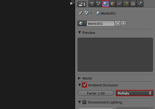
Much better!
Adding the background
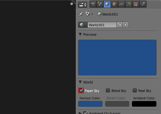
We want to choose a colour for the background that compliments the golden text. The easiest way to do this is choose a colour that is opposite it on the colour wheel. In this case, blue. I have used the values R: 0.015 G: 0.075 B: 0.250

We will be adding textures in a moment so to ensure that they display properly, make sure you enable Paper Sky.
To make the text pop out of the scene more we will be adding a circular gradient that is a lighter blue than the background.
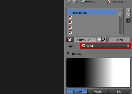
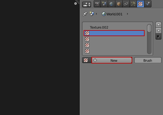
Switch to the texture panel (making sure that World is displayed at the top) and click New to create a new texture.

From the drop down menu select, Blend.
The default blend texture is black and white. To edit the blend texture click Ramp in the Color section.
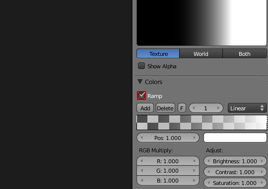
The handles on the left and right side control the gradient. You can select the anchors by clicking on them.
Change the color of both anchors to a light blue colour. I have used R: 0.520 G: 0.660 B:0.900.
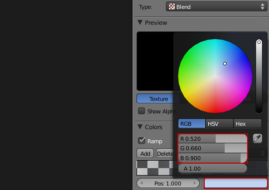
Next, slide the right most anchor point the middle. This will make the circle gradient larger and cover more of the background.

In the Blend section click the dropdown menu and select Quadratic Sphere. This will change it from a horizontal gradient to a circular gradient.
Enable Horizon so that the texture is applied to the world settings. Enable Stencil to create a mask for the next texture that we create.

Add a new texture underneath the one we just created.
Leave the default texture type to Clouds. Change the Size to 0.5 and the Depth to 6. This will create large detailed cloud patterns within the gradient we just created.
Select Horizon so that it is applied to the world settings.
Change the blend type to Add so that the cloud settings boost the luminosity of the gradient.
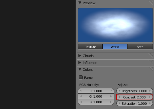
Change the colour of the clouds to the same light blue color we used before (R: 0.520 G: 0.660 B:0.900)

Almost there! In the colour options increase the Contrast to 2.
Here's what our scene looks like with the background:

So far so good, but it could be better. For one, the blue areas are looking a little boring. To spice it up, let's add some stripes!
Adding stripes
The best way to add stripes to any design project is to create your own. But don't worry! It's actually very easy.
Head over to StripeGenerator.com and create a stripe texture that suits your needs, using the very easy interface provided. When you've finished just hit download to grab a small tileable texture. It's not a bad idea to save this website to your bookmarks as it's pretty handy :)
Here's the settings I used:

And here's the texture it created:

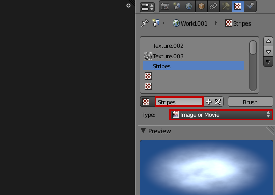
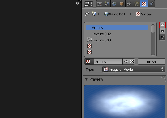
Add a new texture underneath the others.

Label this texture Stripes and change the type to Image or Movie.
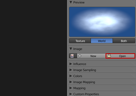
Click Open and locate the stripe texture.
In the influence panel, enable Horizon and set the amount to 0.007 (this will make the stripes opaque).
Change the blend type to Screen so that the black stripes ignored and only the white stripes are rendered.

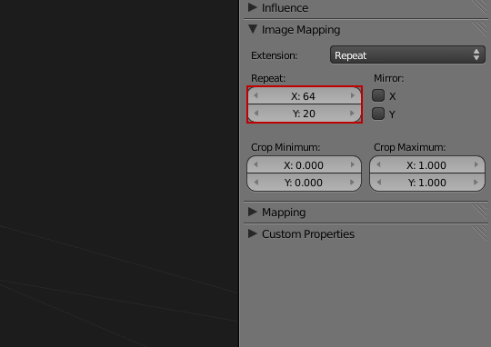
Currently that tiny texture will stretch out across the entire background, and obviously look awful. To fix that we need to work out how many times to tile the texture.
To work that out you need to take the render dimensions (2560x1600) and divide by the texture dimensions (40x80). So, 2560/40 = 64 and 1600/80 = 20. Therefore we need to set the repeat values to X: 64 and Y: 20
Next move the Stripes texture to the top of the texture stack so that it isn't effected by the Stencil mask we created for the gradient. You can do this by clicking the up arrow key next to the texture stack.
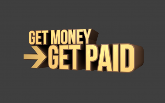
Now hit render!

Where you go from here is up to you, but it should hopefully get your creative juices flowing :) I have added a cash register, money and glare to produce the final render:

>>Download the finished .blend<<
Download the Wallpaper
Something you can do for me
Want to help both Blender Guru and the Blender community out in one fell swoop? Float this post!
3d typography is an extremely popular topic for people in the design industry, but currently nobody knows that Blender is even capable of creating it! By floating this post you can help get the word out that Blender is a great tool for 3d typography. It only takes 2 minutes to register:
>>Float this post<<
--------------------------
I hope you enjoyed this tutorial! As usual I'm looking forward to seeing your results. Feel free to post them in the comments below ;)