
I drew everyday for 2 years. Here's what I learned.
I’m a 3D artist by day, but by night I’ve been teaching myself 2D, because it offers so many complimentary skills.
The aim was to complete at least one of drawing/painting every single day. This is the journey of how that went.
I started with absolutely no education whatsoever. I literally just opened Photoshop and started drawing… to some predictable results.


The only way is up right?
So I started watching tutorials. Mostly Proko (free youtube), as well as his paid course: Figure Drawing Fundamentals.


Whoa!? How did I improve so drastically so quickly? The tutorial illusion.
Mimicking someone else’s actions is easy, because it’s so fresh in your mind you don’t need to commit any lessons to memory (which if you’re not careful can result in you forgetting 99% of the content). If you’re not careful, this can give you a false sense of competence, setting yourself up for a depressing realization when you create something on your own.
I then switched to portraits, following the Portrait Drawing Fundamentals Course.


For reference, these are the artworks I did when I went solo by myself. Not as bad as my untrained start, but not as good as the tutorials.

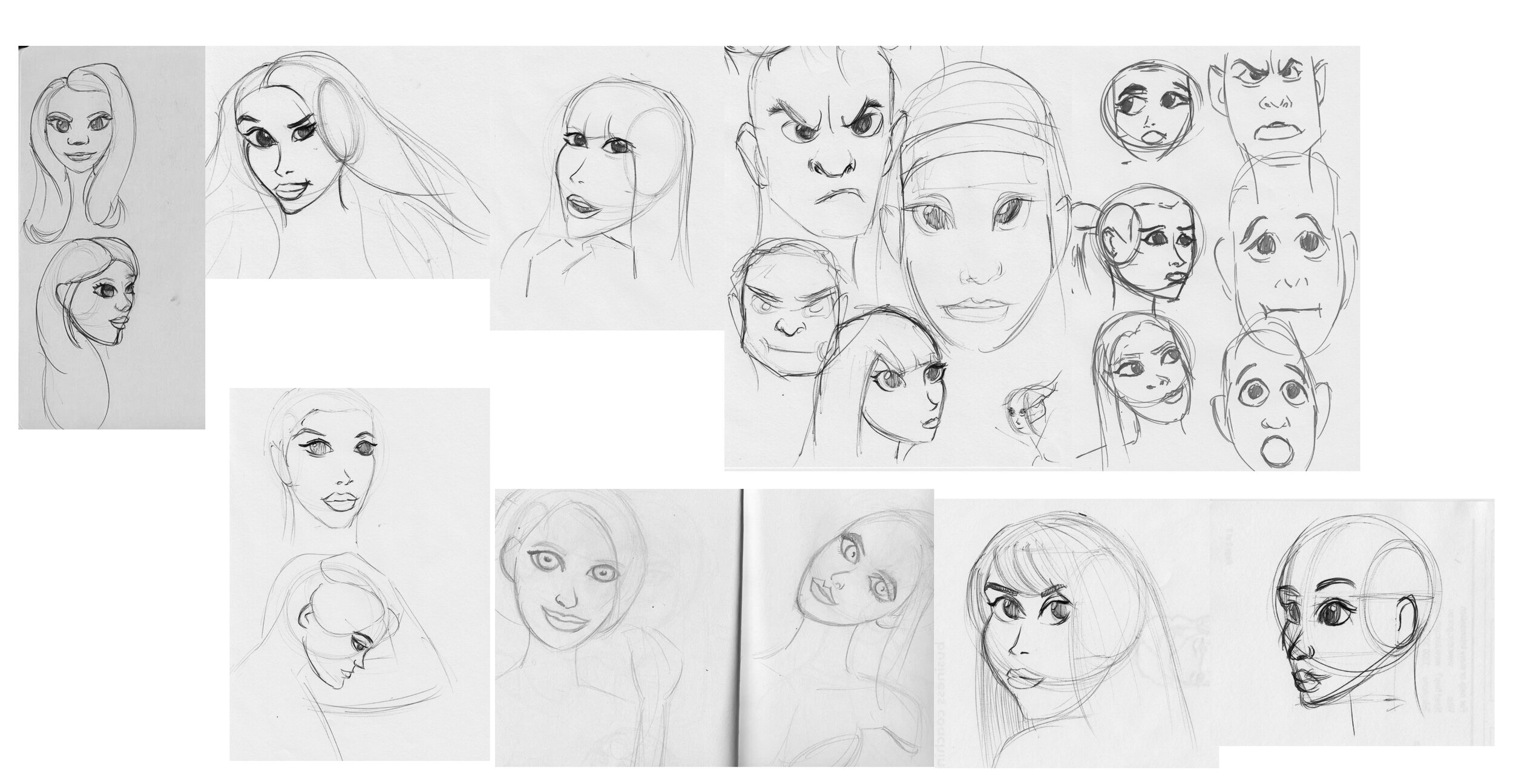
Throughout this I was also trying to learn stylized portraits. Large eyes, tiny chin and nose. Typical anime derivatives.
I stumbled around for far too long because I was drawing one, then moving onto the next without analyzing why the last one was wrong.


After 2 months of the traditional pencil & charcoal, I felt I could graduate to digital. So I started watching tutorials from ctrl-paint.
I spent waaaaay too long on each piece. Each of these were probably 20-30 hours each, which would be fine except I was barely learning. I was zoomed right into the canvas copying pixel for pixel from the reference. Very little learning happens that way.

And you can tell from my progress drawings that proportions were off but I didn’t realize until later. And because I was in a rush, I didn’t stop to learn the lesson.
My most successful painting at the time was Rey. It was a typical painting, but I deliberately left some parts unfinished. And then when I revisited it a day later I started experimenting with a brush & color dodge.
I would later learn this looked more interesting because unlike pure realism, it was infused with artist interpretation.
Then I thought I was ready for stylization (I was not), and made some pretty bad paintings that took far too long.


And again from the progress pics, you can see I had no idea what I was doing. Realism here, simplification there. All over the place.
Then this was my final painting to close out the 6 months:
Over these 6 months I was training 3 hours every night after work, and about 8 hours on weekends, which is not sustainable. I was so exhausted I took a break… a 3 year break.
3 YEAR BREAK
The reason this took so long was that I frankly didn’t enjoy drawing on a tablet (Wacom Intuos) because your hand moved in one place, but the cursor in another.
But then in 2018 I was gifted an iPad Pro for Christmas, which unlike a tablet, I actually felt like I was drawing on paper! That was all I needed to get back into it.
I started a little rusty, but after a few hours the experience from prior began to come through.
After getting bored of sketches I divided into full shading and realized I barely knew what I was doing. Had I forgotten what I had learned? Or had I never learned it to begin with?
Why does the one on the right look significantly better? I didn’t realize it at the time, but again: interpretation. It’s got exaggerated features, sketchy lines and charcoal looking brushes. But again, I didn’t realize this at the time.
Due to my inexperience, I thought the problem was that I needed to learn likeness through caricatures. So I took a 6 month detour into focusing solely on caricatures:
After failing to capture Kanye’s likeness 50 times in a row (I’m not kidding) I realized I wasn’t learning.
It would only occur to me later that this was because exaggeration requires thorough knowledge of the average, because otherwise you won’t know when it derives from it.
By chance I started listening to the Draftsmen podcast, which mentioned the importance of perspective, so I figured I might as well learn that next. I started with some exercises from How to Draw by Scott Robertson, followed by some facial structure exercises from Figure Drawing by Michael Hampton.
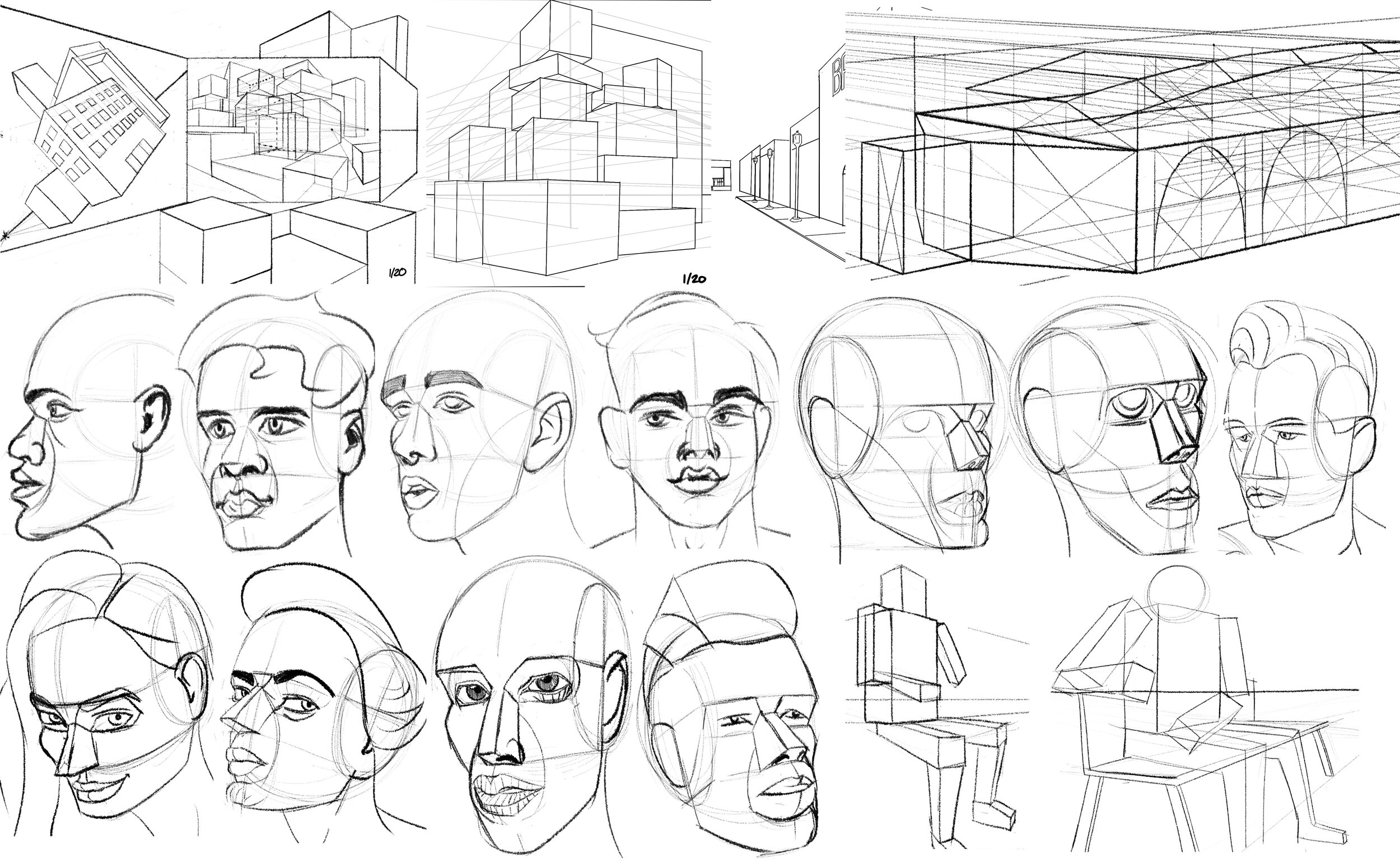
I spaced these exercises with some fully shaded pieces (mostly to scratch my own itch), and they slowly started to improve:
I had an epiphany when I realized I could create my own feedback loop with reference. Sketch once, overlay directly with reference, note the discrepancies then repeat. Like this:
I practiced this over many weeks, and gradually the core mistakes started to vanish:
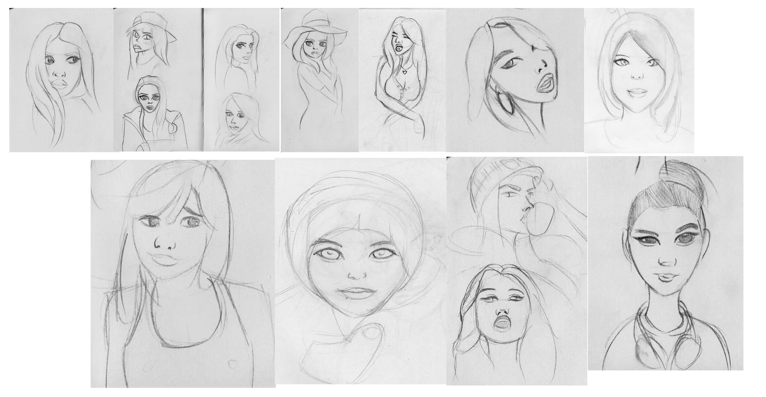
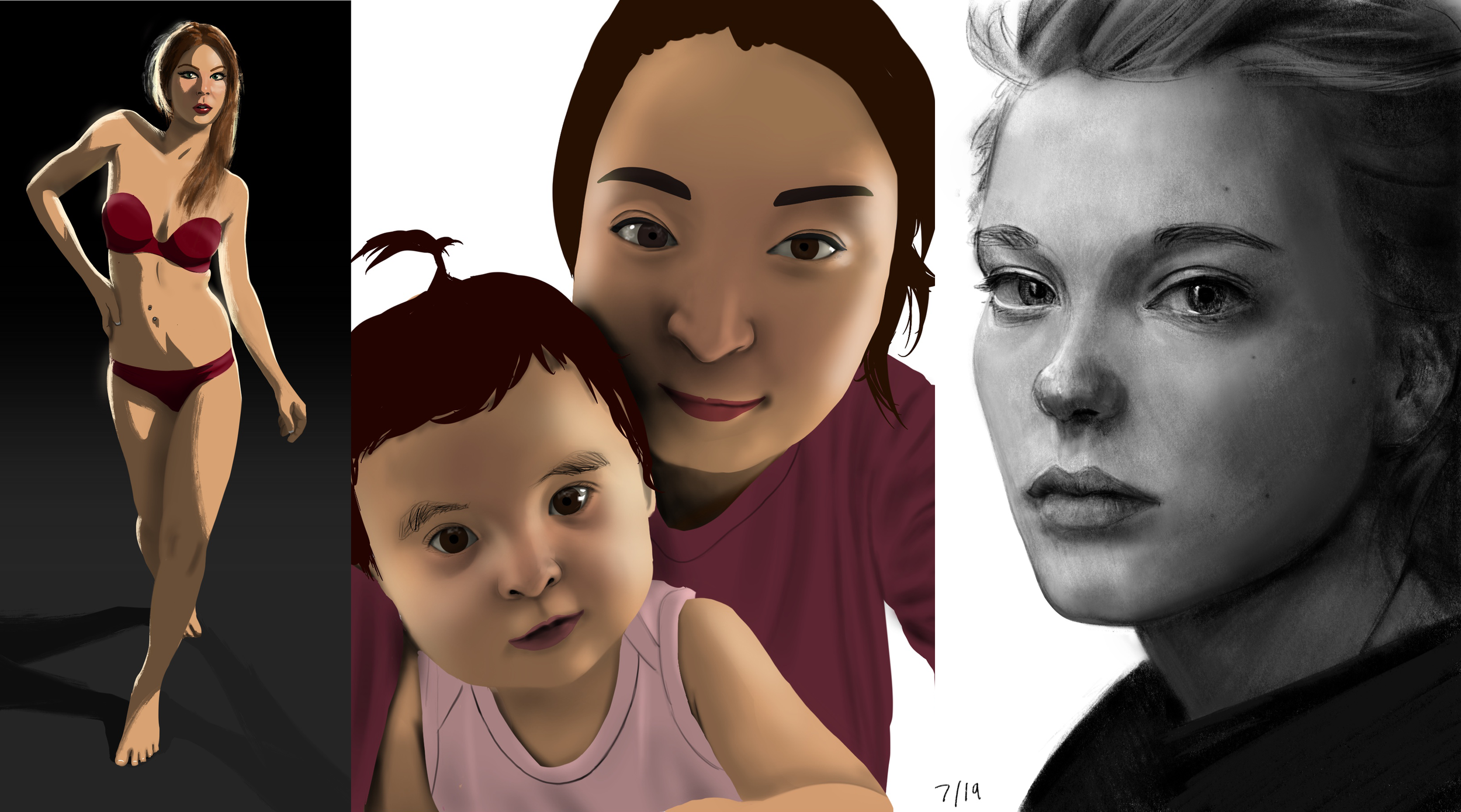
A friend suggested I draw family instead. So I did a few weeks of that:
At some point though I realized that even if a drawing had perfect proportions, it could still be boring. And on the flipside, flawed proportions could look interesting. The reason? Again, interpretation.
One way to do that is gesture. So I followed this gesture video by Proko, applied to faces:
And I was honestly blown away by the results. Fast and loose sketches had worse proportions, yet I preferred them over my previous attempts!
I then switched to shading… and it would be dishonest if I didn’t share some of my failures. So here’s a few that made me rage quit before they were completed:

Some made it further along, though in this case you see the proportions then started to suffer:
I noticed that trouble usually arose when I copied reference with soft lighting (this is like a beginner skier starting on the expert slope).
So instead I switched to coping reference from movies, which typically has much harder lighting.

After weeks of this, I started to dip my toes into color.
I expected it to be harder, but I actually found it easier than B&W because it the changing hues and saturations made it easier to see form.
I was feeling confident so I switched back to referencing instagram models…
It started great (because the reference had hard shadows) then ended terribly, because I tried to simplify and stylize a soft-lit reference (expert slope).
I decided it was time to revisit proportions, and shading. So I went back to B&W sketches.

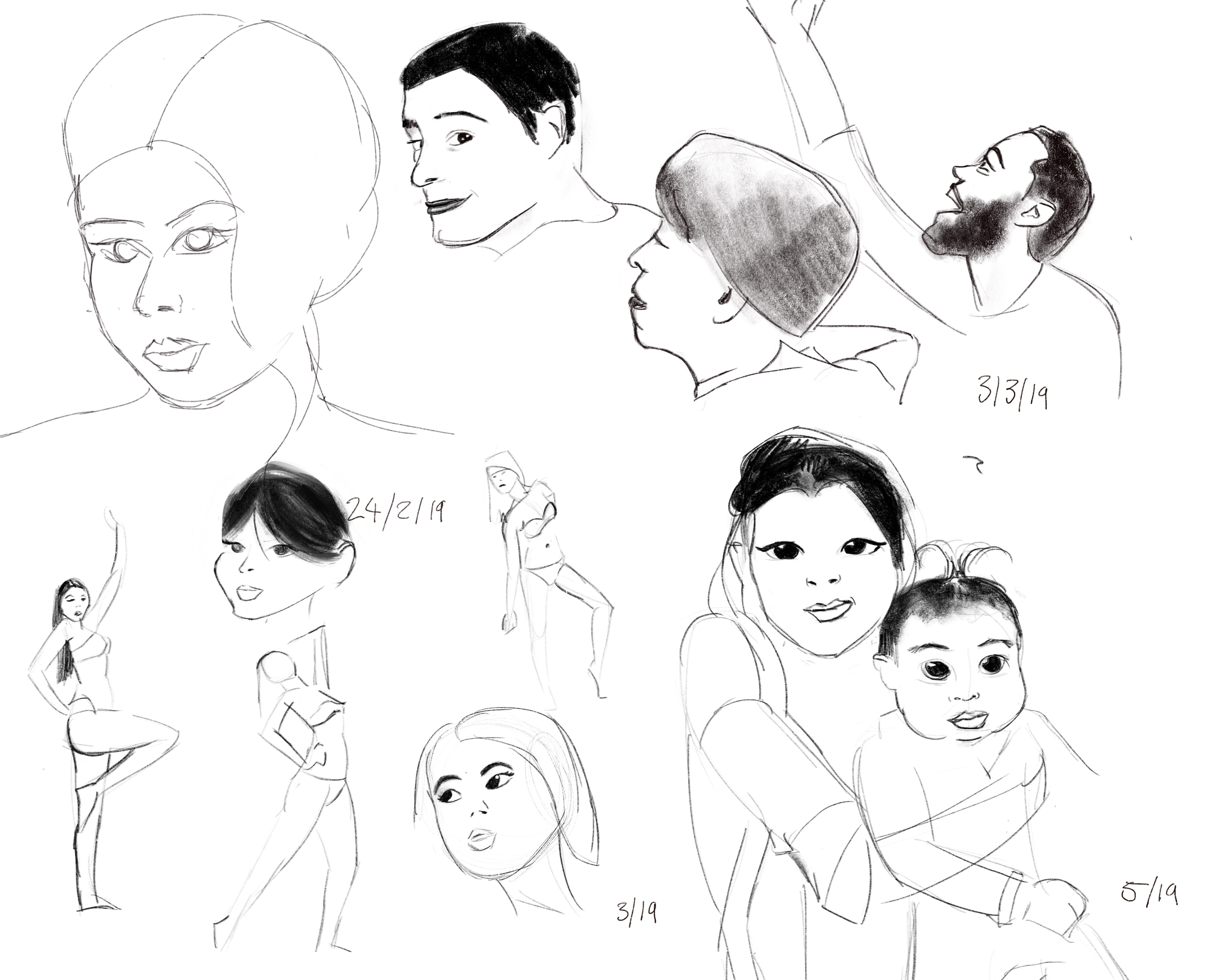
In these attempts I tried to maintain good proportions, while achieving more gesture driven strokes. I didn’t always succeed, and sometimes it was a mess, but practice makes perfect.
Someone on instagram suggested I do timed facial sketches. I was skeptical, since I thought this exercise was only valuable for full figure gesture sketches, but it worked just as well for faces!
It doesn’t achieve the likeness of the reference, but that’s not the point. So I learned to accept that.
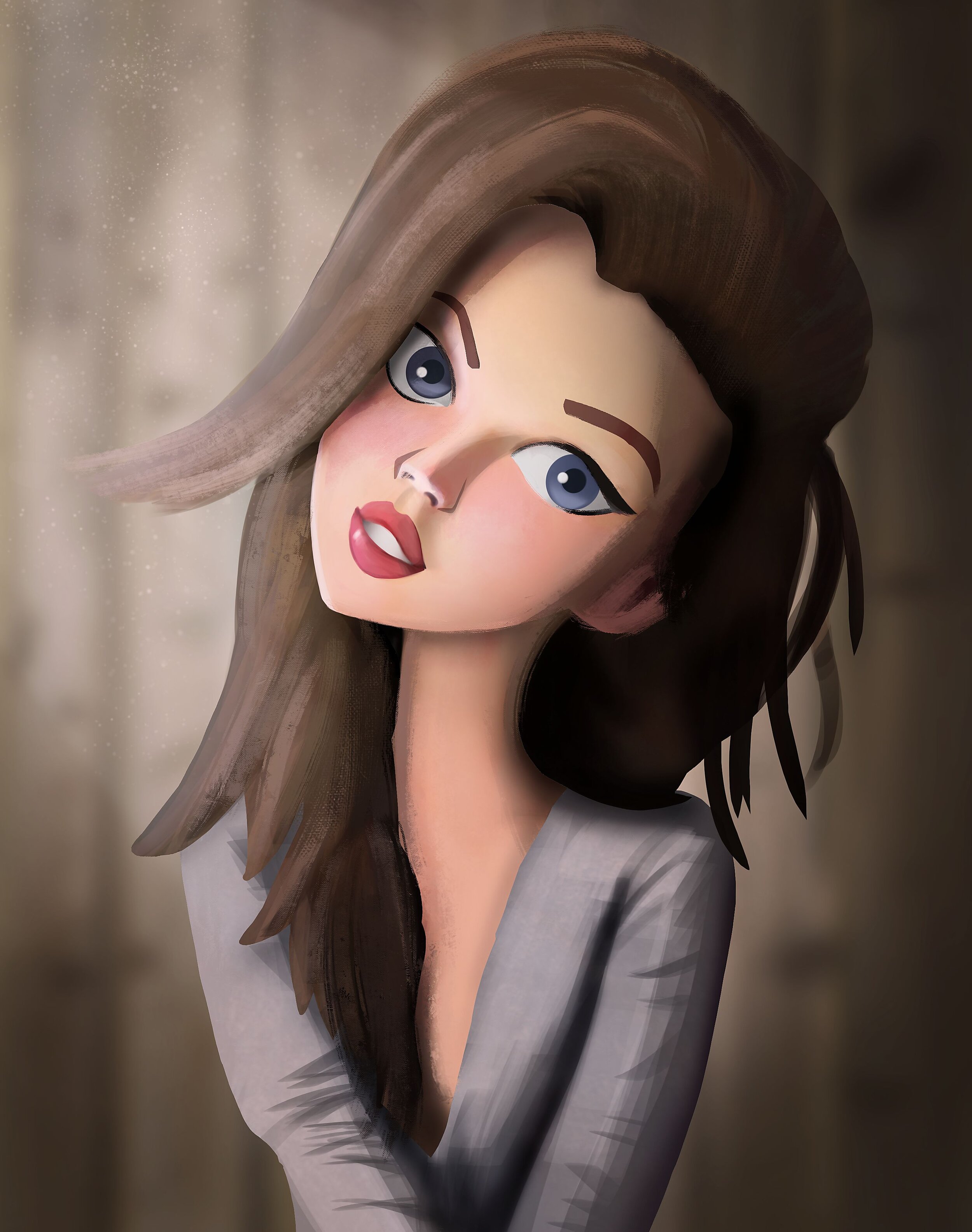
I thought I was ready for some stylization next, so on the right you can see an attempt to turn a gesture drawing into a cartoonish, shaded result (without any care for likeness).
This exercise made me realize how complicated illustration is, because you can’t outline everything or it looks awful. And you also need to vary stroke width.
And the moment you add shading, it seems that everything needs shading.
It was honestly a mess. I didn’t enjoy it, nor was I pleased with the final result. I’ll have to try again later.
I was feeling drained, then watched this video by FZD and realized why. Faces are really hard, and punishing when you fail at them.
So I then spent a week trying to understanding simplified shading, using some hard surface objects. In this case a planar head and a fire hydrant.
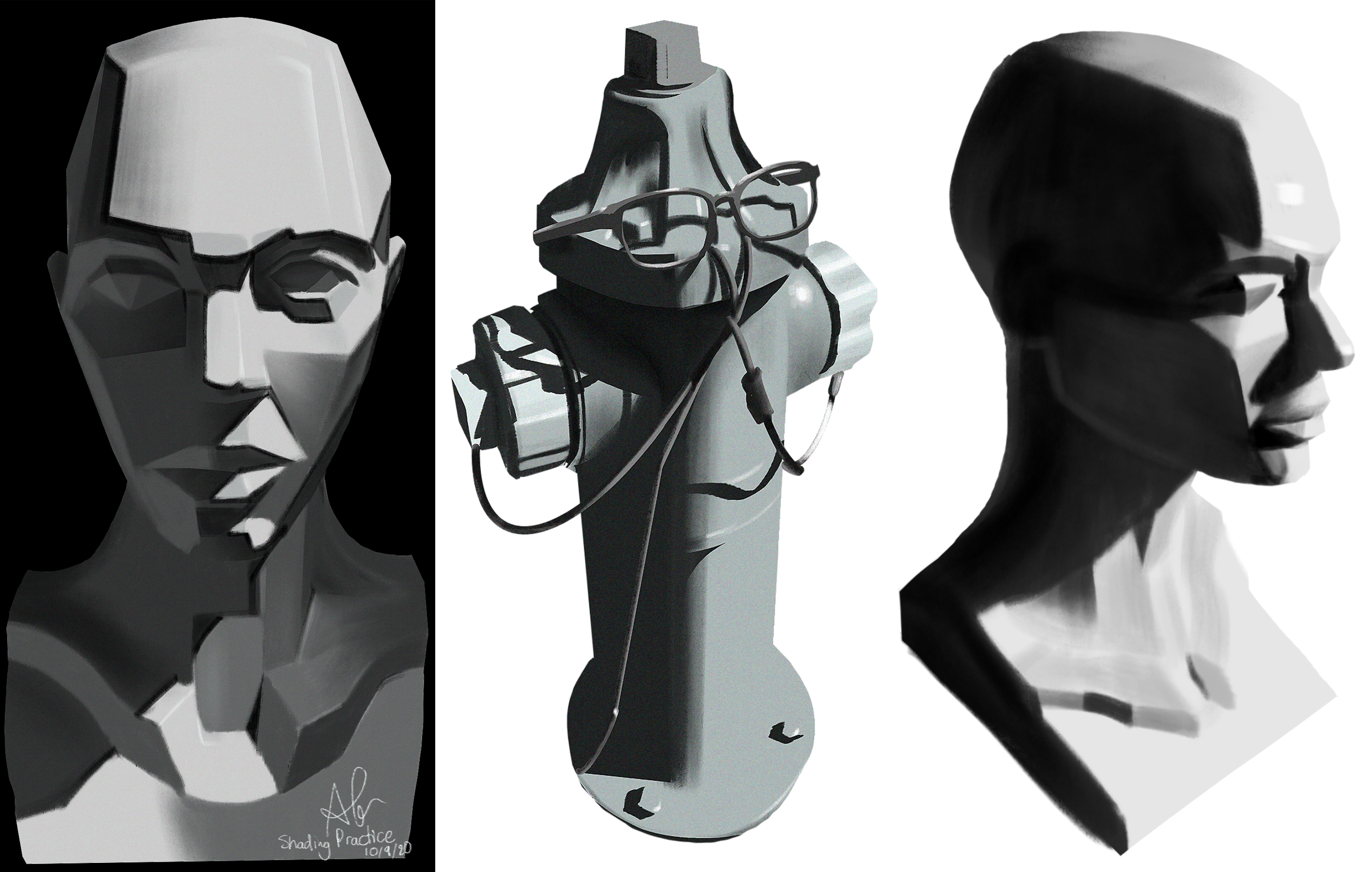
Next I jumped to a fully shaded face…
This was another painful learning experience. The value differences across the face were so subtle that it was far too challenging.
Again, this comes back to choosing the right subject of difficulty. Feminine, soft-lit faces are the expert ski slope.
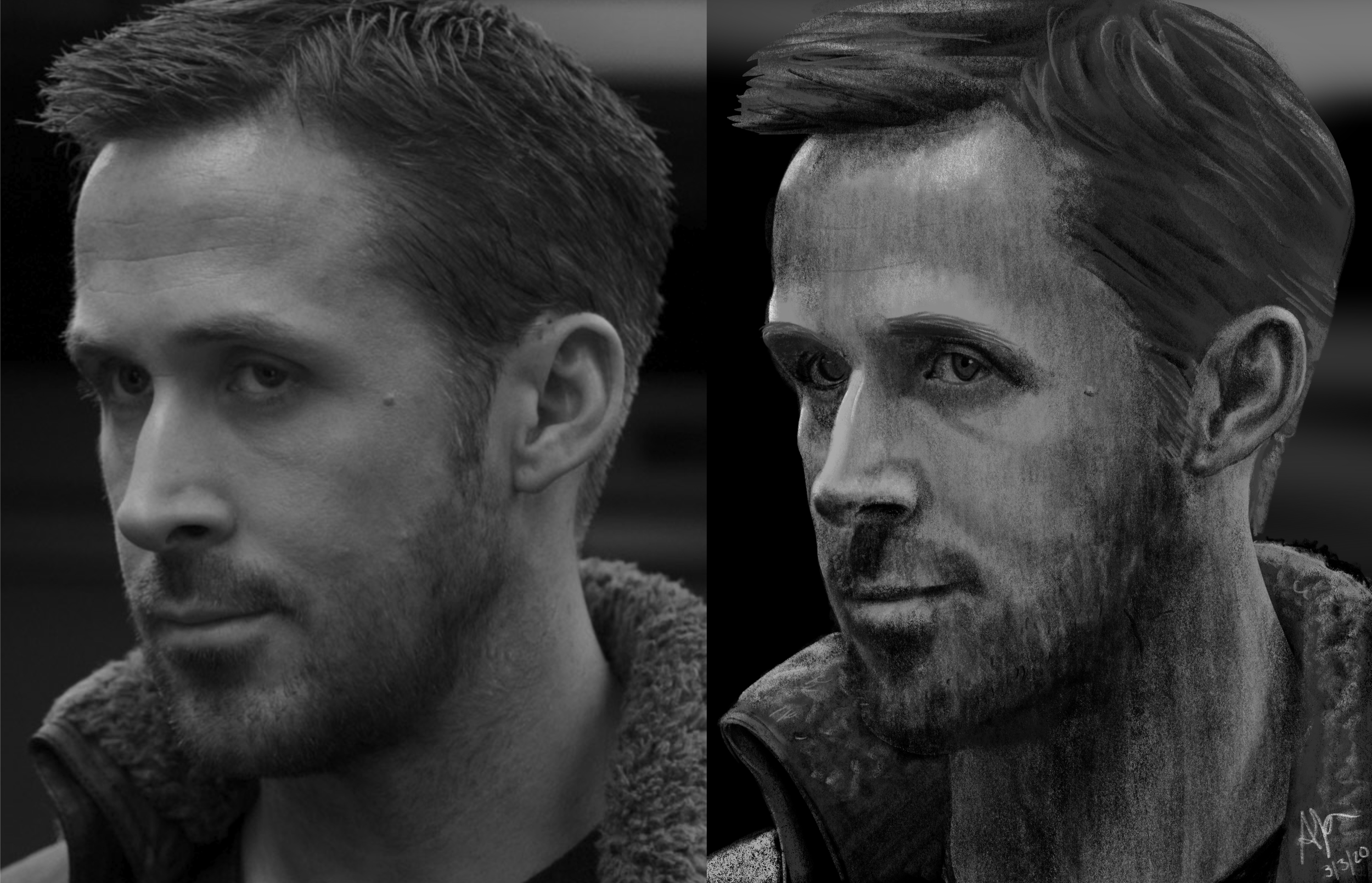
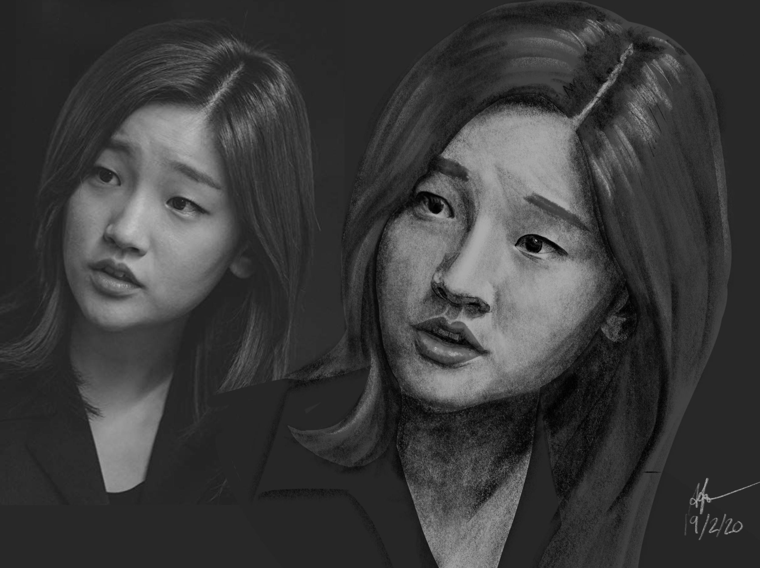
So I switched to some hard lit frames from movies and shows. And in this case, I did so many from Breaking Bad I put them all into one composition:
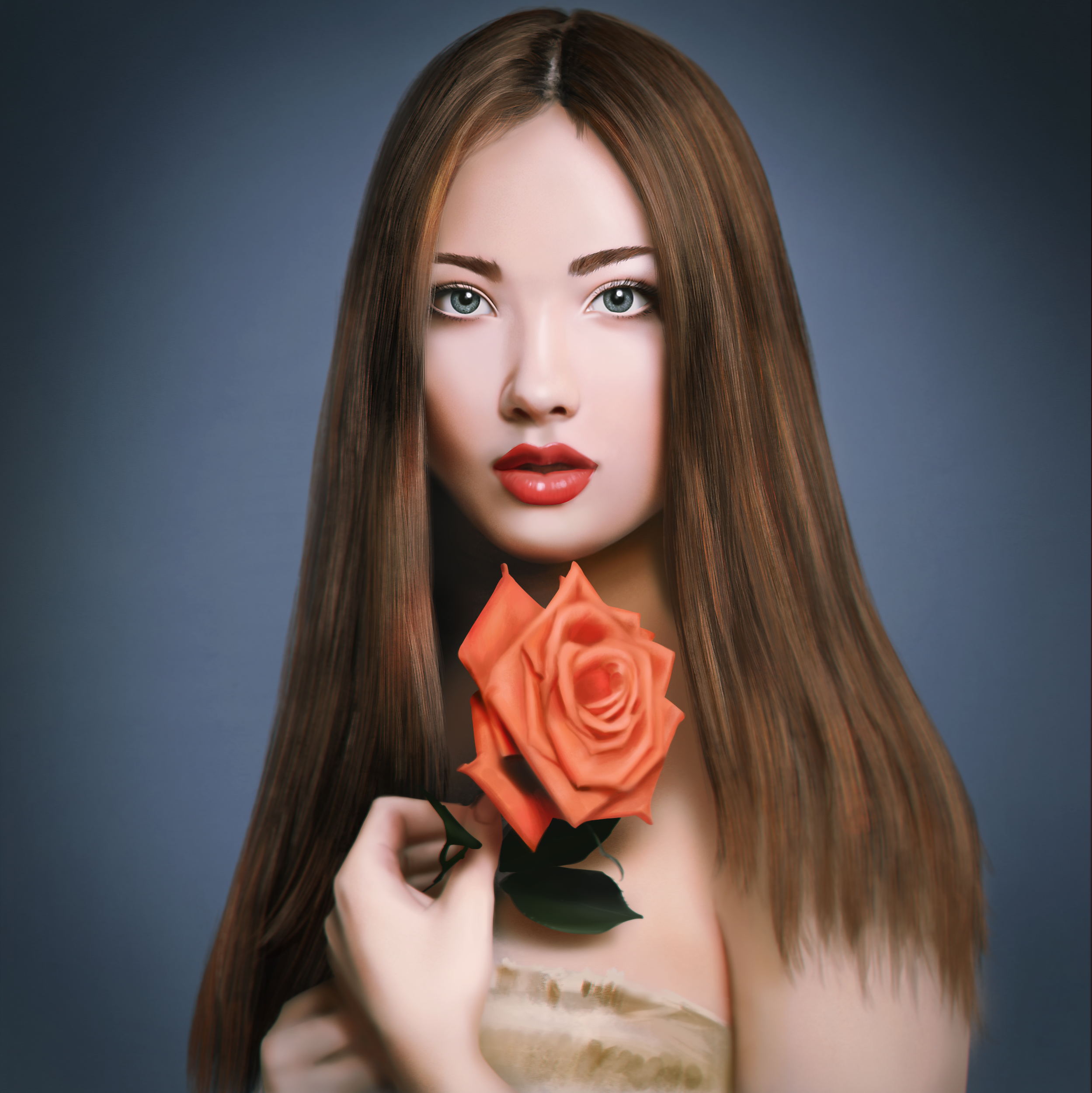
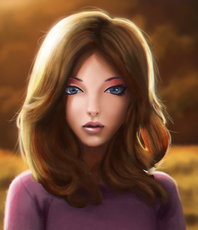
Then finally it was time for some full color movie paintings!
I had a lot of fun with these, because while focused on realism, I got to emphasize small differences in value, or subsurface scattering.
I also discovered that the closer the subject is to the camera, the longer the painting will take because you need to add tiny hairs for it to feel complete.
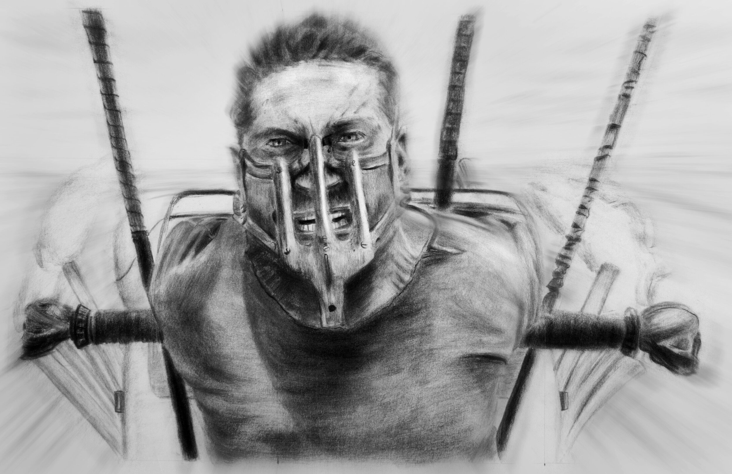
And finally, this became my most popular piece on Instagram. GORLAMI.
These are the main lessons I learned from this 2 years process:
- Build a feedback loop. Learning happens by recognizing you made a mistake, and aiming to correct it on your next attempt. Yet because most artists think “practice makes perfect” they complete one drawing and move to the next. You need to be able to compare your drawing to something, or you won’t be able to recognize where it can improve.
- Focus on one thing at a time. Yes, it’s fun to make final images. But they aren’t very good for learning, because anything could be wrong: proportions, gesture, shading, perspective, simplification, anatomy, color - or something else! That’s like listening to 5 pieces of music simultaneously. There’s just too much conflicting information. You need to remove as many elements as possible in order to see what’s truly wrong.
- Interpretation drives interest. A photograph will tell you exactly how it is, but not what is important. Art is most interesting when the artist does try to tell you what is important. Like simplifying detail, exaggerating form or distorting selected elements.
But the hardest part about all this? Remembering that for the next piece.
Follow me on Artstation and Instagram.