
Fixing Blender - Part 1: Why It's Broken
After some researching, I've come to the frightening truth: Blender's interface is really quite un-friendly. This video series explains why, and how we can improve Blender for the better.
Transcript
I've been using Blender for almost 10 years now and I've seen come a long way.
However there's one area I think it's lacking: Usability.
Lately I’ve found myself more and more lost in Blender: Unsure of whether I’m going to break something, completely at a loss for what half of the buttons do, and overall just a feeling that I don’t understand how anything works anymore.
So I read a book, then another and then another. And finally reached the uncomfortable truth: Blender is pretty anti-friendly.
Now I want to stop to say that this video series isn’t to point fingers at anyone. And certainly not the developers who have volunteered their time to give us this great software. I'm doing this to open the floor to new discussions, and suggestions for improvements as a community.
Why is it important?
Usability is important because it doesn’t affect how we use Blender, but it effects the size of the userbase.
Whilst we all hear the stories of ex-Maya users switching to Blender, we rarely hear the stories from the other direction. Blender users fleeing.
But I do.
I’ve kept a newsletter list for over 4 years and in that time I’ve had over 45,000 people signup to it. But many of those Blender users are no longer with us, so I often get replies of “Thanks for your help, but I’ve made the decision to switch to 3dsmax.”
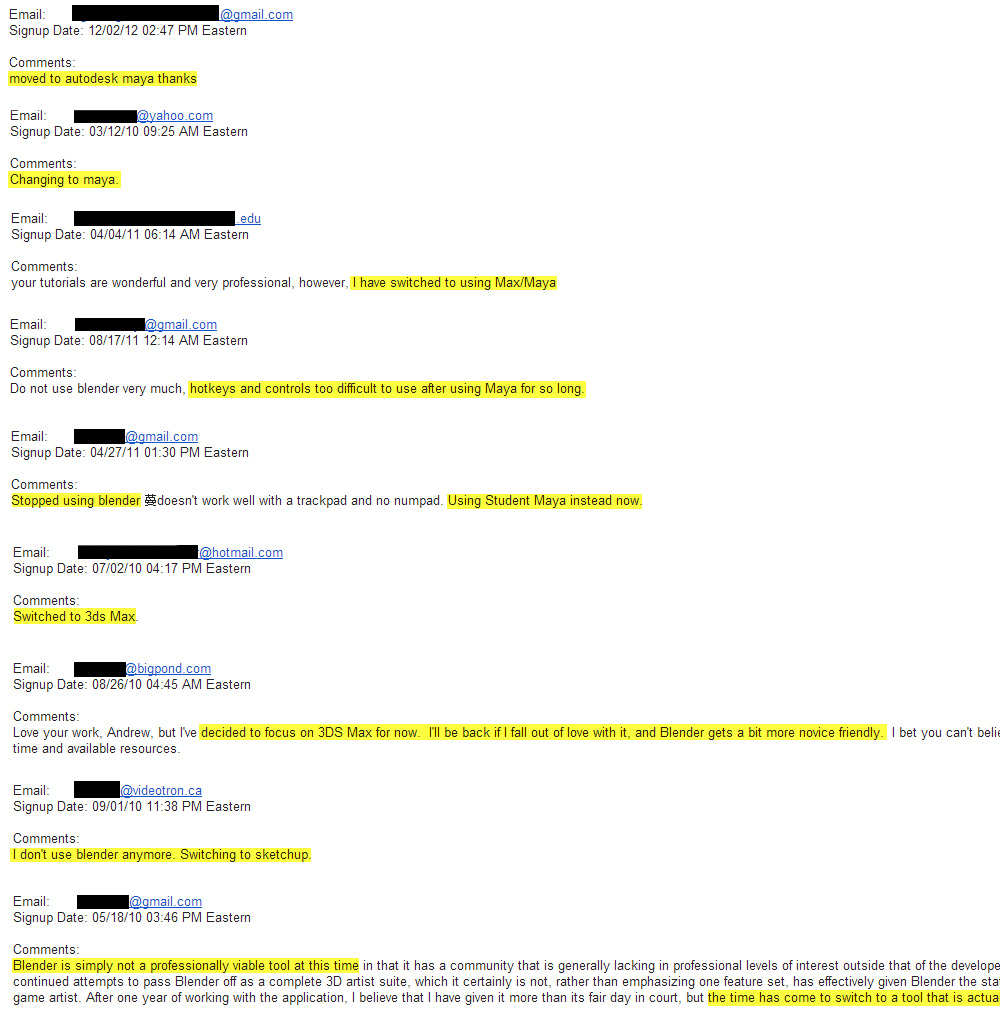
Reasons that people gave for leaving the newsletter
This is important, because the amount of Blender users affects the number of jobs available to us in the industry, the number of studios adopting Blender, the number of paid developers joining the foundation, and the amount of third-party plugin support.
There are some amazing plugins out there for 3ds Max, that unfortunately Blender users will never get to experience, because the small user-base doesn’t justify making it compatible.
So yes, usability is incredibly important for the future of Blender.
So with all that in mind, sit back, relax and enjoy this introduction to usability, starting with a quick history lesson.
History of UI
Although the first computer emerged in the early 1940s, it wasn’t until the 60s that an effective way to interact with it them was created: The Command Line Interface, or CLI. You probably know it best by scary appearance of green blinking text on a black background.
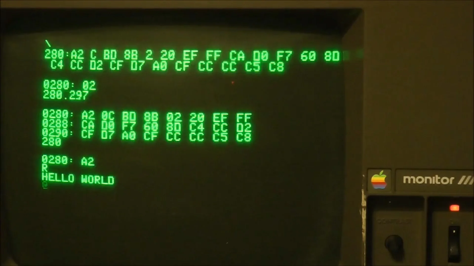
CLI – The old way of interacting with computers
CLI relied on commands to be entered manually by the user. These commands were often long and hard to remember, so obviously it wasn’t very accessible to the general public.
But in 1973, one of the biggest breakthroughs in computer history entered the scene: The Graphical User Interface (GUI).
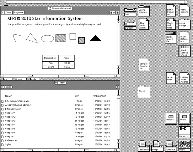
The World’s First GUI – The Xerox Star System
This was a completely new way of using the computer, as it allowed you to see what was on screen and interact with it. Now users could simply select what they wanted from a menu instead of having to remember the command. This completely removed the burden from the users memory, allowing them to instead focus on their goals.
As a result, this style of interface was quickly adopted by Apple and Windows, and the rest is history.
Since then interfaces have evolved into an integral part of software and operating systems, as it largely influences why we continue to use certain software and avoid others.
Now on the surface it may be tempting to assume that User Interfaces are simply a matter of personal taste. Like icecream.
But actually good usability is deeply connected to human psychology. By studying how the mind works, you can create a killer interface which mesh seamlessly with how we think and perform tasks.
"Bottom line: user-interface design guidelines are based on human psychology.” -Johnson, Jeff. Designing with the Mind in Mind
If you don’t believe me, take a look at one of the worlds first usability standards, produced in 1987 by American Computer Scientist, Ben Shneiderman:
- Strive for consistency
- Cater to universal usability
- Offer informative feedback
- Design task flows to yield closure
- Prevent errors
- Permit easy reversal of actions
- Make users feel they are in control
- Minimize short-term memory load
Now, compare it to another usability guide released 3 years later by two blokes in Denmark:
- Consistency and standards
- Visibility of system status
- Match between system and real world
- User control and freedom
- Error prevention
- Recognition rather than recall
- Flexibility and efficiency of use
- Aesthetic and minimalist design
- Help users recognize, diagnose, and recover from errors
- Provide online documentation and help
Notice how they both essentially say the same thing? Most interestingly of all was that neither copied off each other. So how is it that two guides emerged saying almost the same thing?
"The answer is that all of the design rules are based on human psychology: how people perceive, learn, reason, remember, and convert intentions into action." - Designing with the Mind in Mind
So it’s no surprise that they drew the same conclusions.
Now when you combine the two standards together you get a list of 8, which have become the benchmark for good usability today.
- Consistency
- Familiarity
- Recognition over Recall
- Error Prevention
- Feedback
- Recovery from Mistakes
- Simplicity
- Goal Oriented
In this part we’re going to focus on the first 4, and Part 2 will cover the remaining ones.
1. Consistency
“The more consistent the operation of different functions - the less users have to learn.” -Designing with the Mind in Mind
Consistency is important for interfaces as it reduces the learning curve and the amount of thought that each user needs to apply before performing an action.
As an example, take a look at the Microsoft Office 2013 suite. By keeping a familiar toolbar at the top, similar icons and identical keyboard shortcuts, users can devote less thought to the program they’re using and more on the task they came to accomplish.
“The consistency of an interactive system strongly affects how quickly its users progress from slow operation, to automatic, faster operation.” --Schneider W., Shiffrin R.M. Controlled and automatic human information processing: 1. Detection, search, and attention.
In Blender, consistency is applied well in the tools Grab, Rotate and Scale. These commands work across nearly all screens, including the viewport, f-curve, camera tracker and even the node editor! This allows you to devote less time to the action and more to the goal that you’re trying to accomplish. This consistency is fantastic, and a testament to the developers for ensuring that these functions perform the same across all work modes.
Blender Inconsistencies
There are some areas in Blender where consistency is lacking:
- Actions - Most actions work by tapping the key, then moving the mouse as the action is being performed. But the Grease Pencil tool works by holding the key (D) and clicking and dragging to perform the action.
- Clicking- Users learn that to select something in the viewport is Right-click. But in many other places, it’s left-click, requiring the user to apply thought to which workspace they are in, before clicking.
- Buttons- To create a new material, users know to click the ‘Add New Material’ button, but in the Ppost System no such button exists. Users discover by themselves that it’s the + button.
- Shortcuts- To bring up the toolbar you press T, and for the properties panel, N. However in the Image Editor it’s the opposite. T brings up the Properties, and N prints up the toolbar.
Now I should take a moment to explain that it’s up to the users to report these inconsistencies, via the bug tracker. So the fact that these exist aren’t the fault of the developer alone, but moreso the thousands of users who either never noticed, or just couldn’t be bothered reporting them (like myself). But alas, we're discussing it now, so let’s work together and keep a closer eye on it.
Consistency also extends to vocabulary and design:
- Drop-down boxes- Most have an arrow pointing down, which is great, as it's universally understood. However other parts of Blender use a dot symbol, even though they both perform the same function.
- Slider function- The slider value box allows you to understand that there are maximum and minimum values. However many value boxes don’t have this slider, despite minimum and maximum values present.
- Limits- Some value boxes only let you drag to a certain value, but let you manually enter a value higher. Whereas other boxes won’t.
- Animation- Blender generally uses frames to measure time. However in some areas like the physics box, it uses seconds.
And finally an inconsistency that I’ve heard many users bring up, is the value system. Taking a look at the Cloud textures, the options are .25 size, .03 Nabula and a Depth of 2. Now obviously we’re dealing with a procedural texture, so there’s no “real world units” that we can use, but it’s not clear why such arbitrary values were chosen, or why some react to small increments and others only to larger increments. Take lamps for example. The default Sun Lamp energy is 1, and increasing it to 2 doubles the power. But the default Point lamp energy is 100. If you increase it to 101, the energy is obviously not doubled. This requires the user to remember that the Sun reacts to slight increments, but the Point lamp reacts to large increments. This drastically increases the amount of thought required before changing any value.
Now this may not sound like a huge deal on the surface, but if you look across Blender, you’ll notice that almost every aspect of Blender users it’s own unspoken units. This requires the user to remember how each function reacts to change before they use it. This slows them down, increasing the number of test renders they’ll probably need to do before finding the “right value”.
And whilst we’re talking about values, there’s also the issue with decimal points. Many values have far more decimal points than is necessary. Confusing the user into thinking that by increasing it in whole numbers, the value will have a large effect. But often this isn’t the case. Decimal places are even found in places where it doesn’t make sense, like frames.
“In an inconsistent system, users cannot predict how its different functions work, so they must learn each one anew, which slows their learning of the overall system and keeps their use of it a controlled, attention-consuming process.” -Designing with the Mind in Mind
By creating a more consistent Blender, we can reduce the learning curve. As well as allow for existing users to work faster by freeing up their mind to focus on their goal, and not their actions.
2. Familiarity
“...people learn from their experiences constantly, often without awareness that they are doing it.” -Designing with the Mind in Mind
Familiarity is deeply ingrained in the human psyche. We learn from a very early age to discover how new things work, and repeat the action the next time we see it.
For example, when we were kids we learned that a tap is turned on by rotating the handle counter-clockwise. The next time we saw a tap, we identified it, tried the same action and it worked. Now it didn’t matter if you were at home, school or hong kong. You could turn on a tap wherever you went.
Occasionally you’ll come across a tap that requires you to turn it in the opposite direction. It’s never quite clear why this decision was made, but it usually always yields the same result: confusion, frustration and anger. Being forced to relearn a task at the expense of it’s designer is not something we accept willingly.
In the case of computers, Microsoft and Apple became aware of this concept early on. And so they developed a set of computer standards to ensure that users only need to learn something once. Even across platforms.
An example is the clicking of the mouse. Users learn that to select something is always left-click, and that to see it’s options is right-click.
This translates across almost every piece of software, where left click is select and right click is options. For example:
- Photoshop.
- Word.
- Premiere.
- Gimp.
- Linux.
- The Internet.
But not Blender. Sadly in this story Blender is that tap that turns in the opposite direction.
For whatever reason, Blender selects with the right-mouse click.
Now I know that this is a hot topic. But please hear me out.
With every computer user already used to left-click as the conventional way to select something, Blender is going against the stream.
When users open Blender for the first time, by habit they try to select objects with the left-mouse click. When this doesn’t work they’ll become confused, frustrated and angry. Sure they figure it it eventually, just like we did, but that’s making a huge assumption that they’ll stick around to learn it.
“Even when people know they could solve a problem or perform a calculation if they put effort into it, sometimes they don’t do it because they don’t consider the potential reward worth the effort.” -Designing with the Mind in Mind
Unless you have a friend who’s told you it’s right-click, you need to find the answer online, which is actually buried on the forth result, half-way down the page.
Back in 1998 when Blender was first programmed, right-click may have been no big deal. But as the 3d industry grows, more and more high school graduates are looking for careers in gaming, vfx and 3d related jobs. That means more and more people are trying out Blender as the first software to start learning. But if they can’t even perform the basic task of clicking something, they may just throw in the towel.
“If you’re not going to use an existing convention, you need to be sure that what you’re replacing it with either (a) is so clear and self explanatory that there’s no learning curve - so it’s as good as a convention , or (b) adds so much value that it’s worth the small learning curve. If you’re going to innovate, you have to understand the value of what you’re replacing, and many designers tend to underestimate just how much value conventions provide.” -Don’t Make Me Think
Besides, most existing Blender users know that they can change this option in the user preferences panel, but beginners don’t. By changing the default to left-click, it would only cost existing users about 3 seconds to change it back if they wanted, but by leaving it at the default right-click we potentially lose lots of new users, who simply give up, with the impression that Blender is just too difficult to use.
Now I get that this is a hotly debated issue. I hate having relearn something as much as you do. But again, it’s easy for existing to user to change and will inspire new users to keep learning.
For the future success of Blender, this cannot be overlooked. After all, if you downloaded a new piece of software, and you had to use google before the first click. Would you stick around?
3. Recognition over Recall
““Recognition rather than recall” is one of Nielsen and Molich’s (1990) widely used heuristics for evaluating user interfaces.” -Designing with the Mind in Mind
“The relative ease with which we can recognize things rather than recall them is the basis of the graphical user interface (GUI)” (Johnson et al., 1989).
“Recognition over Recall” simply means that to recognize something with your sight is easy, but remembering something from memory is hard.
For example: What’s the shortcut for recalling the last render in Blender?
Probably took you a while to recall that.
“At the very least, designers should avoid developing systems that burden long-term memory. Yet that is exactly what many interactive systems do.” -Designing with the Mind
Now some say that Blender’s shortcuts are one of it’s strong points, and I’m not arguing with that. It allows for a very fast workflow. But you may be surprised to learn that Blender isn’t unique. Most software today has keyboard shortcuts. But the difference is that they also provide visible tool icons and menu items.
“Make it easy for users to switch to faster paths after they have gained experience. The slower paths for newcomers should show users faster paths if there are any.” -Designing with the Mind in Mind
The best interfaces provide users with two methods of performing an action. By recognition (beginners) and by shortcut (experienced users).
For example, Firefox lets you click the + icon to create a new tab, or remember the shortcut as Ctrl+T.
Gimp lets you select the tools from the menu bar, or by remembering it’s shortcut.
In Blenders case, most functions are completely hidden. If you can’t remember the shortcut, you’re forced to look up it up online. Not only slowing the user, but draining the users goodwill towards the software.
“We as designers really don’t want our software’s users to have to keep thinking about their keystroke-level actions as they work, and users don’t want to think about them either.” -Designing with the Mind in Mind
Some have said that the search box is the solution to this. However it still requires users to remember the name of the tool they want. For example, say I wanted the rectangular marquee tool. In Blender I couldn’t find it because it’s called the Box Tool. So in this case the search tool is completely useless to new users. Not to mention, new users may not even know that the search function exists, without accidentally hitting the spacebar.
The Search function is a great tool, and I’m not saying we should get rid of it. But it should be used as a safety net, if the tool can’t be found anywhere else. Not the primary method for finding tools.
“If a software application hides its functionality and requires its users to recall what to do, some percentage of users will fail. If the software has a lot of users, that percentage who fail to recall— even if it is small— adds up to a significant number. Software designers obviously don’t want a significant number of users to fail in using the product.” -Designing with the Mind in Mind
So the obvious solution is a toolbar. Now I can understand experienced users not wanting to have a toolbar taking up their screen when they don’t need it, but a compromise would be to make it closeable, or completely hidden on startup via an option in the user preference menu.
This solution of icons would give new users a familiar list of tools that they can recall without even knowing their name. And best of all, it wouldn’t interrupt existing user’s workflow at all. As the shortcuts can remain the same.
By adding a toolbar can focus less on remembering keys and allow our minds to focus solely on the goal we’re trying to achieve.
4. Error Prevention
When learning any new piece of software, mistakes are bound to happen. But the interface plays a huge role in determining how many. Just like when you were a child and your mother told you not to touch the hot stove, software should do the same.
Because just like a child, when we first open a piece of software we don’t understand what’s wrong or right.
An example of error prevention is Facebook, where it warns you that you’re leaving the page without publishing your status update. Or in Photoshop that converting to grayscale will cause all color information to be lost. And a really clever one is Gmail’s brilliant reminder that you forgot to include an attachment.
Error prevention is important for trust building, because when warned of unsafe behavior we learn to trust the software and know that it’s got our best interests in mind. But when software allows preventable errors to proceed, we feel betrayed and lose the desire to explore the program fully.
“Most interactive systems have far more functionality than most of their users ever try. Often people don’t even know about most of the functionality provided by software or gadgets they use every day. One reason for this is fear of being “burned.” -Designing with the Mind in Mind
For example, in Blender, some shaders are not fully supported. However, there are no clues to separate supported shaders from the in-development ones.
The subsurface scattering shader is one such example. It’s currently in-development, so understandably there are limitations, such as requiring you to set your feature set to Experimental, as well as use the CPU for rendering. However there are no warning signs to let you know this. So the render proceeds and you’re presenting with a black material. The user is then left to wonder why it happened. They check all the settings for several minutes, maybe scour the forums for answers and possibly wasting hours of time to find the solution.
An easy fix would be to display a warning box underneath the shader once it’s selected. Doing so makes the user feel safer and more likely to explore the great functions that Blender has to offer.
Some would say that experimental features should be given a break, since they’re in development. And whilst I understand development limitations, Blender is always in-development. That’s one of the great things about it. It’s constantly improving. But we can’t allow these experimental features to cause users to lose trust in the software.
Another example is the common black render. Frequently the cause of this is GPU memory overload. Meaning that your GPU doesn’t have enough memory to render a scene of this complexity. But Blender currently doesn’t give you any indication or hints for why it’s happened. From Blender’s point of view it appears as if it’s rendered successfully. A solution for this is to display an error message right there in the render box. This would let users know why it’s happened and give solutions for how to fix it.l
Another common error is rendering with a missing image texture. Blender currently helps out by rendering the material as purple, which is effective, but unfortunately it’s a little late, as the user could have already wasted hours rendering the scene. A better option would be to display a warning before the render even starts. This prevents the error from occurring and makes the user feel safer using the software. It could even make it easier on them by telling them the name of the material that is missing the texture.
And finally a highly controversial topic is whether or not Blender should ask to save when quitting. This is a standard safety prevention feature of most software, to ensure that users don’t lose work by mistakenly quitting with unsaved work. It’s standard in most software, because the risk of not asking, outweighs the possible annoyance it may cause to users who don’t want it.
But Blender makes the assumption that we don’t.
Since this safety net is standard across almost all software, many new users expect to see it. Some people even use it as the way to save their work. So when they don’t see it, they once again, feel betrayed.
And for experienced users, the option to turn it off is always available. In fact it already is. All that needs to be done is turn the default on. And according to a survey I did a while ago, most users are in agreeance with that.
Plus it’d give those critics of Blender one less thing to complain about ;)
A much needed safety net for beginners and a quick change for experienced users who don’t want it = win:win.
Conclusion
By now you can probably tell that I think Blender's interface is holding it back. Whether you agree or disagree, I'd like to hear your feedback.
So please fill out the survey below!
I understand that the interface is a topic that many of you feel passionate about, but play nice in the comments!
Name calling, insults and other immature comments will be deleted. If you find a comment you disagree approach it with maturity and post your reply in a way that is respectful.
It helps to back up your opinions with supporting evidence. Saying "I like the right-click" is a statement of opinion, but justifying it with reason is much more powerful.
Stay tuned for Part 2 next week!